Projects Explore Primland
111 WEST 57TH STREET
Disciplines
- Strategy
- Digital
- UI/UX
- Development
Recognition
- THE WEBBY AWARDS
- REAL ESTATE (NOMINEE)
- FWA
- SITE OF THE DAY
- AWWWARDS
- HONOURABLE MENTION
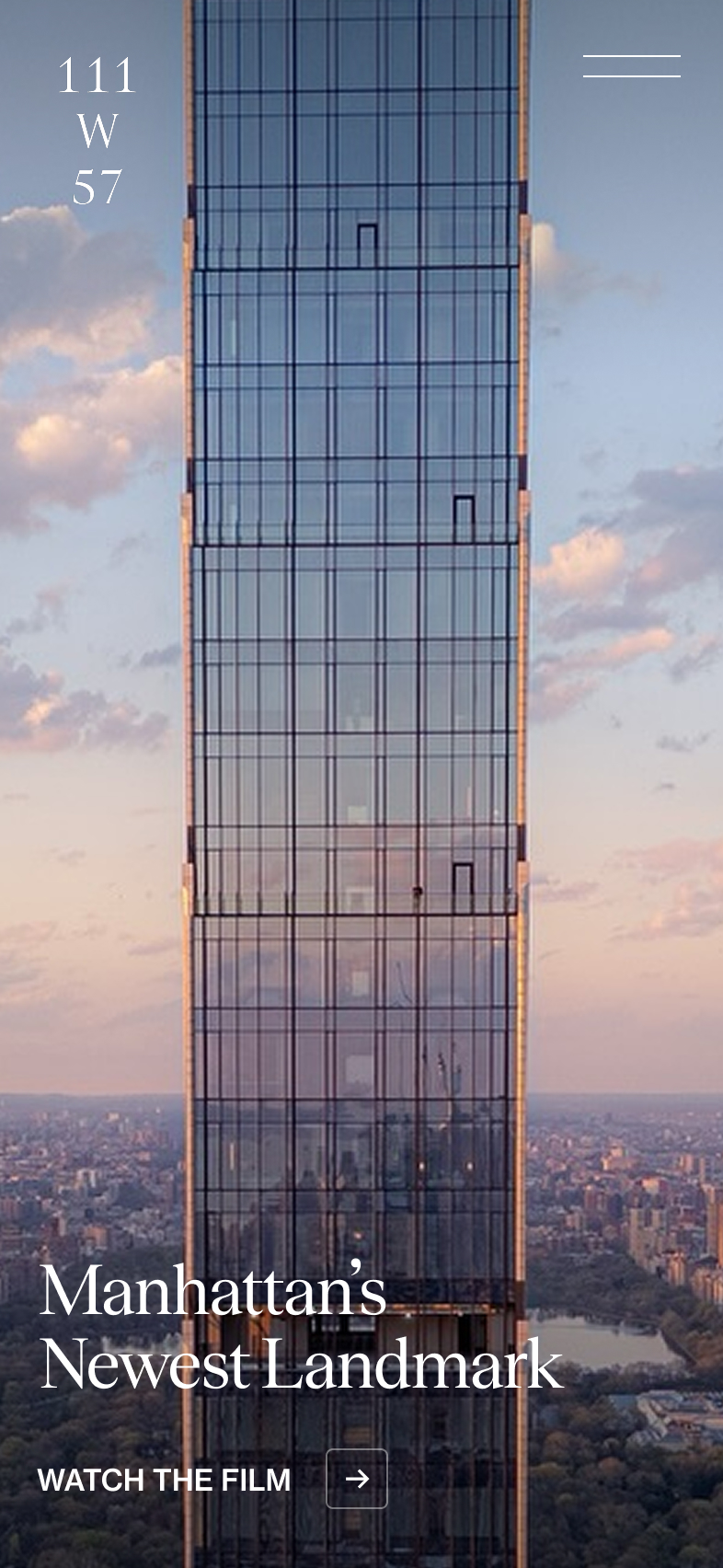
The shimmering tower sits above the iconic Steinway Hall - 111 West 57th Street is beacon of classic and contemporary, art and engineering, elegance and innovation.
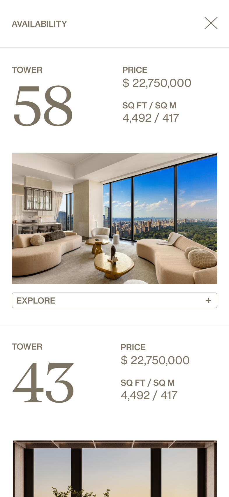
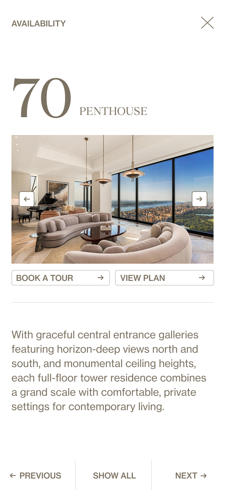
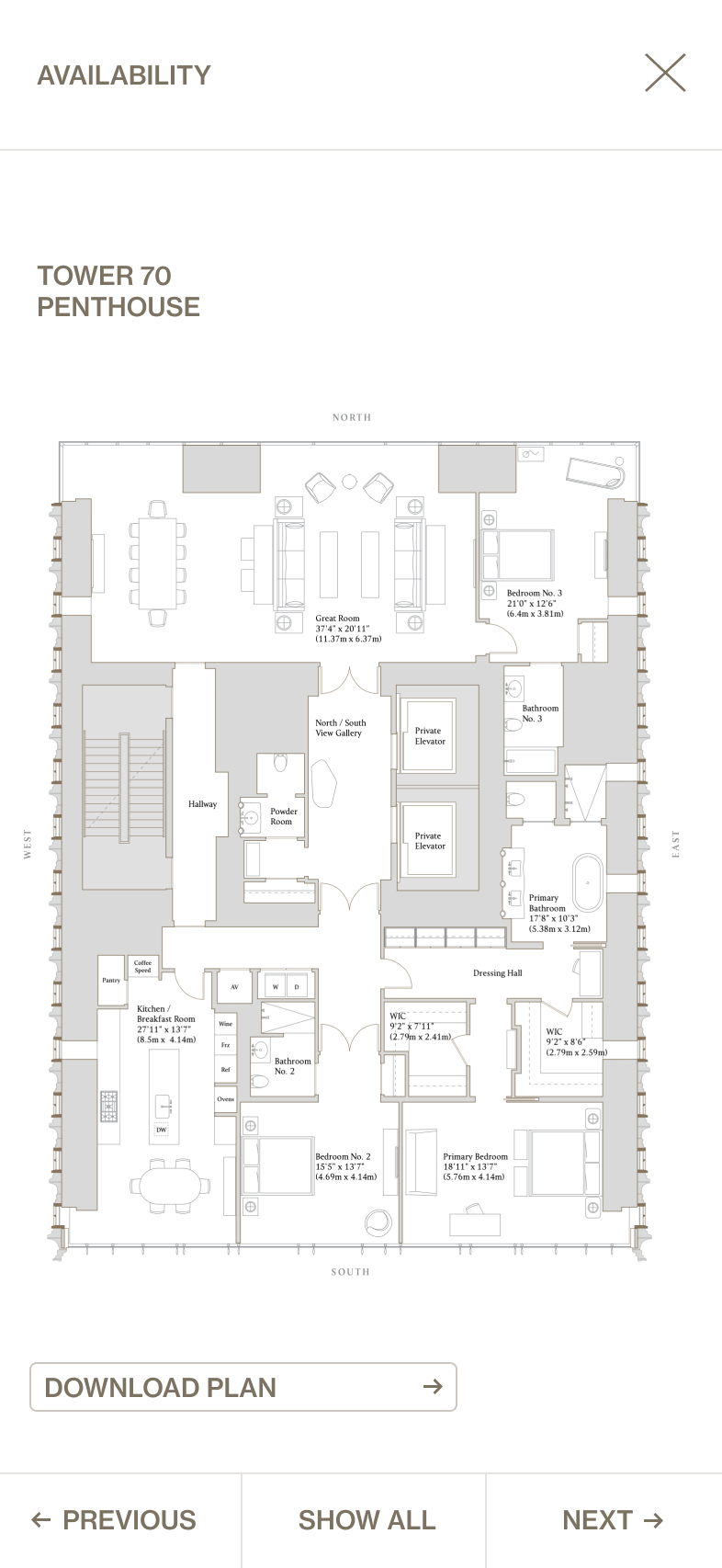
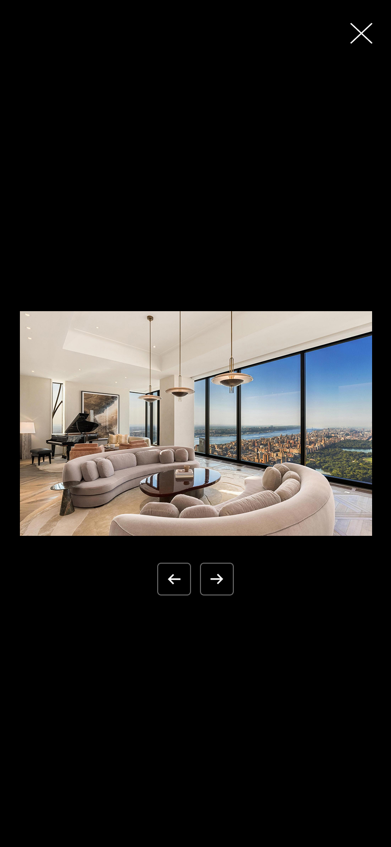
111 West 57th Street sits at 1,428 feet high making it among the tallest buildings in New York City and perfectly centered on Central Park. This modern masterpiece reflects the architectural vision of SHoP Architects and the elegant interiors of Studio Sofield. The result: a new landmark on the Manhattan skyline. Working with Sotheby’s, we were asked to create a new digital destination for 111 West 57th Street, communicating a confident, modern and elegant expression that embodied the luxurious design, craft and innovation while immersing the audience through elevated storytelling.
Visit live site
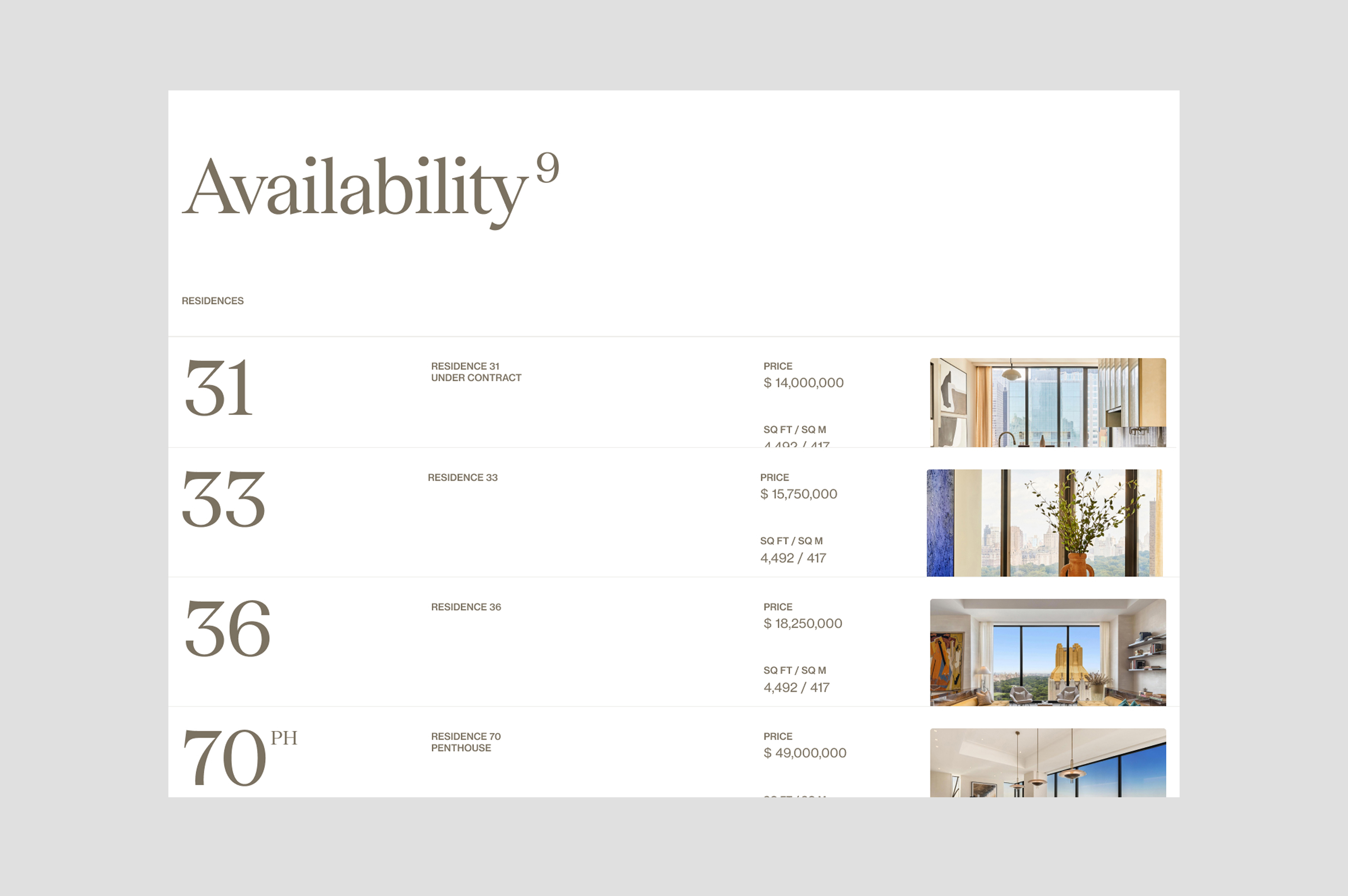
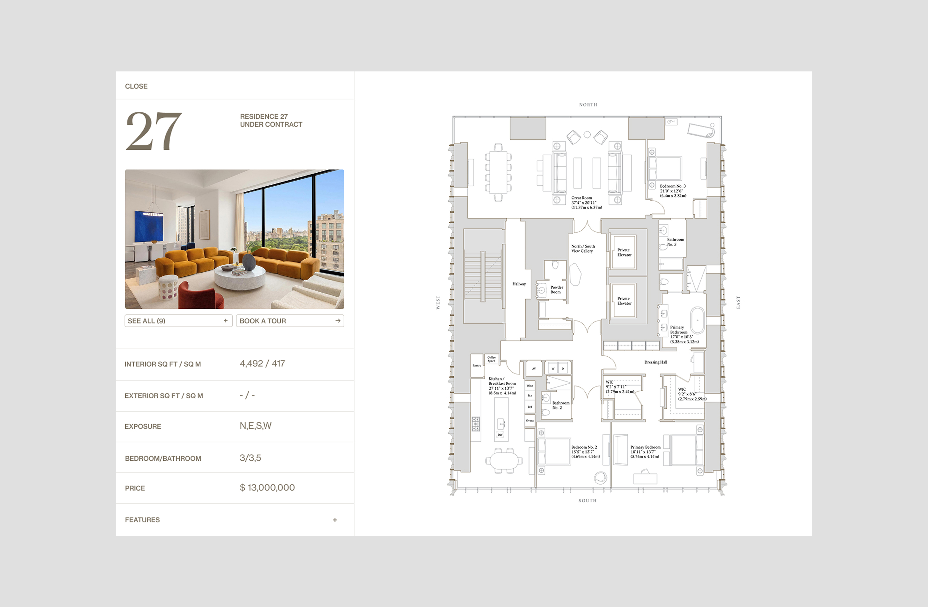
A STORY OF SCALE
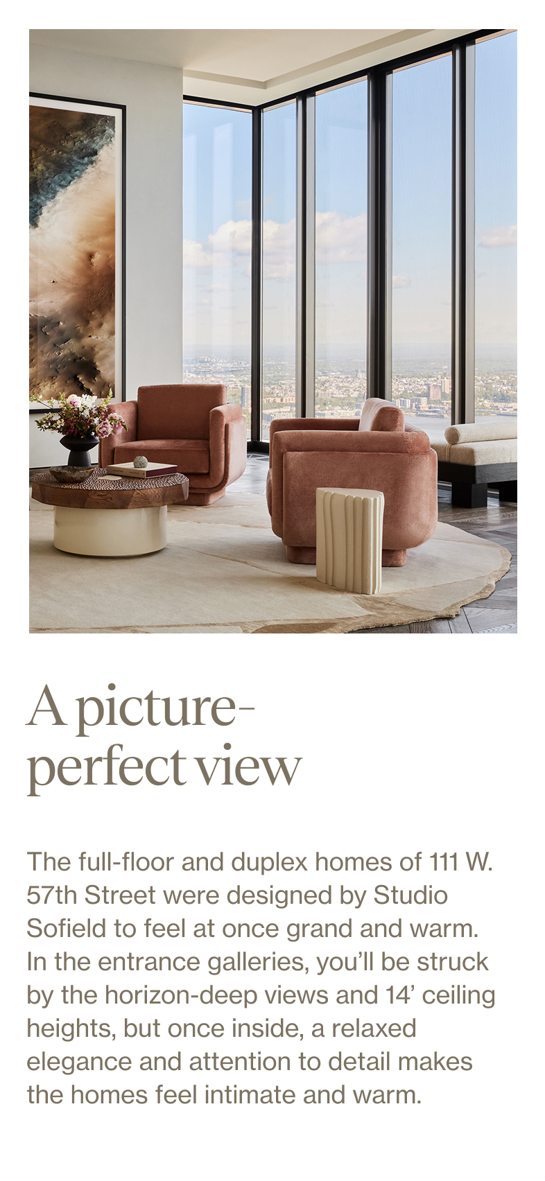
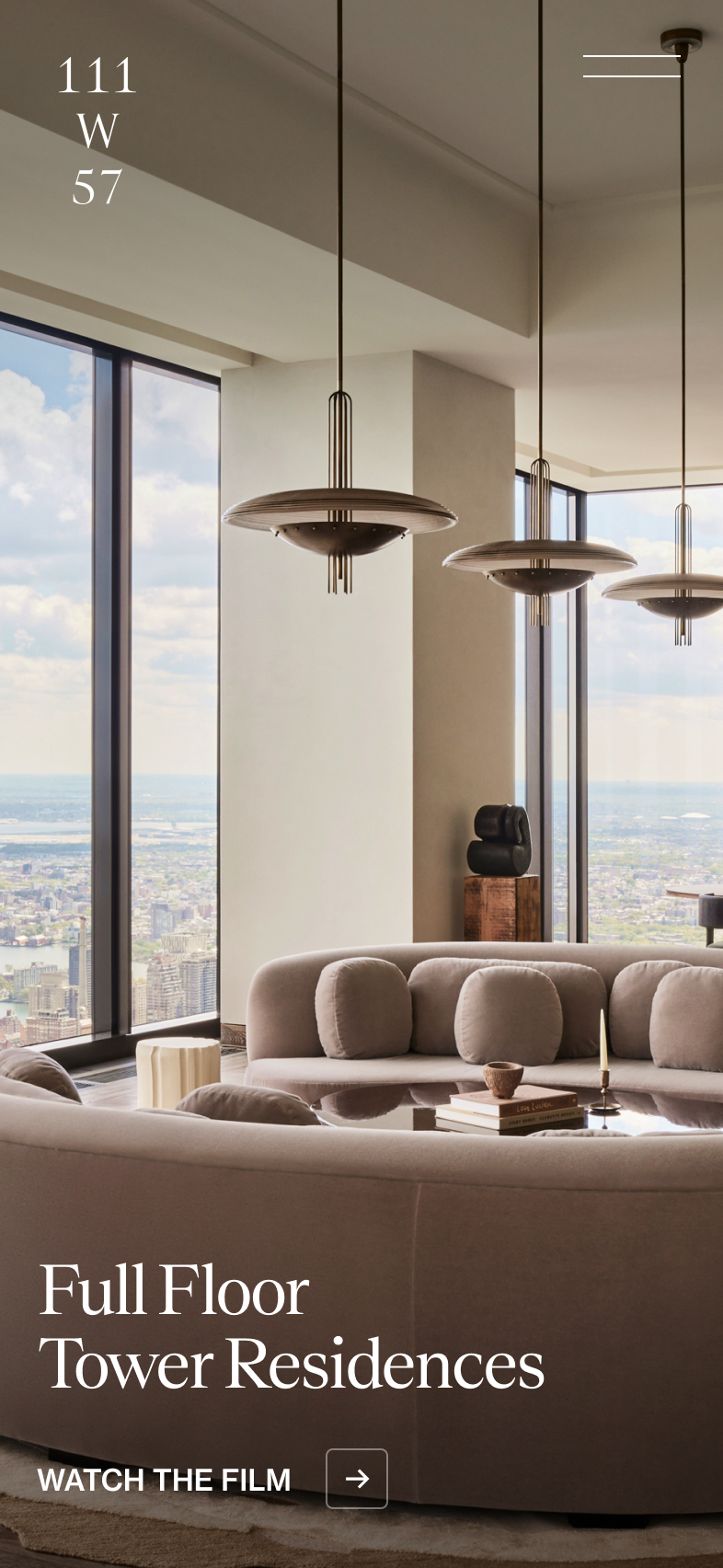
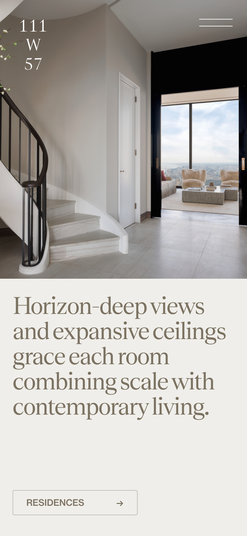
The brief was to create an experience that epitomises luxurious design and functionality - a highly elevated ‘story-telling experience’ that would appeal to the ultra-high net worth audience and drive lead generation. Everything about this building is ‘big’ from being one of the tallest skyscrapers in Manhattan to the super opulent interiors and horizon high ceilings we needed to communicate craft, luxury and scale throughout the experience from the design language to the interactions.
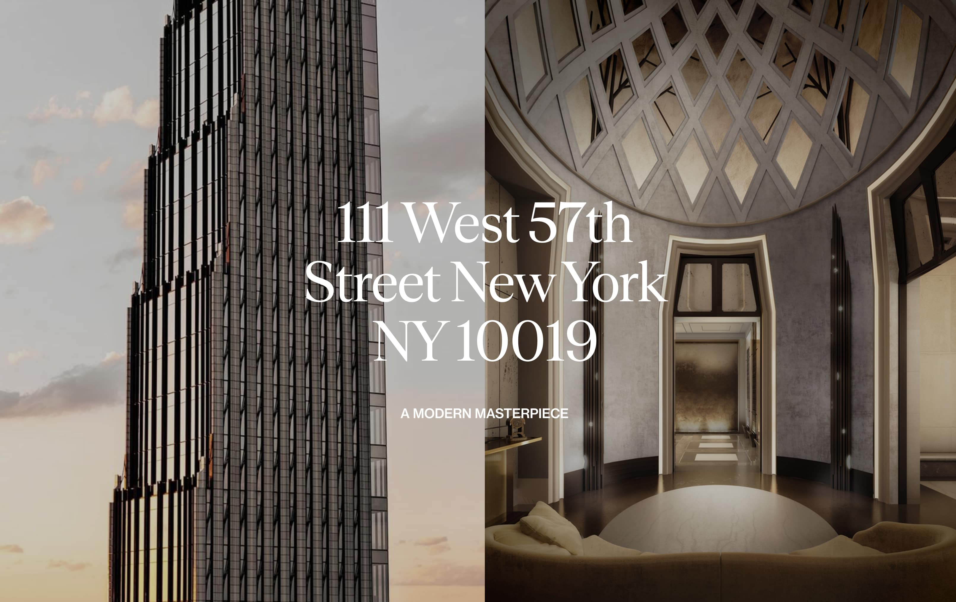
CLASSIC MEETS MODERN
Echoing the natural, organic curves of the terracotta cladding on the building’s exterior and the opulent Art Deco details within, we sought a type palette that would balance heritage with modernity. Teodor was chosen as the primary typeface — its elegant, almost calligraphic serif forms mirror the building’s refined architectural details. To complement this and capture the building’s contemporary, innovative spirit, we selected Neue Haas Grotesk Text Pro for its clean, geometric design. Its extensive family also made it ideal for all UI applications.
DESIGN STRATEGY
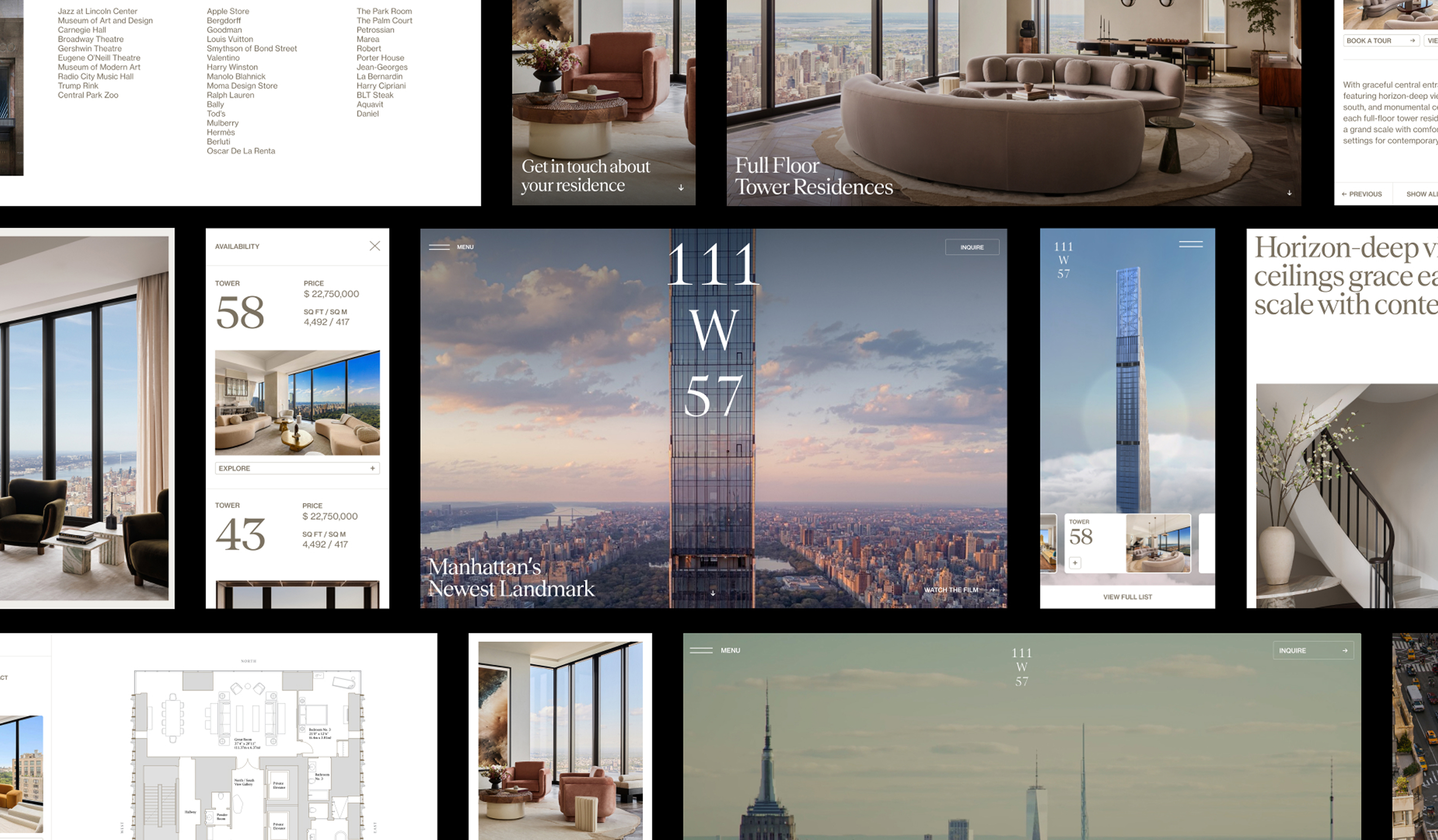
We set out to create a confident, modern, and elegant expression that would do justice to the building. Inspired by its distinctive stepped profile, we translated this into offset page compositions and interaction design — with each module stacking seamlessly to create a sense of rhythm, depth, and architectural balance.
Our approach to motion was purposeful and understated, favouring smooth, considered transitions and refined micro-interactions throughout the site. Every detail was designed to feel effortless, evoking the same sense of luxury, craftsmanship, and precision that defines the building itself.
We have nearly sold out of listings and it’s thanks to your beautifully designed website. We can’t thank you enough.Alex Hare, VP of Marketing Sotheby's Realty
ELEVATED STORYTELLING
We wanted the experience to evoke the feel of a luxurious coffee table book — a curated journey of typographic and editorially inspired page designs, with rich evocative imagery and video content that transforms curiosity into captivation. This approach aligned with our classic meets modern philosophy, embracing generous white space, elongated page compositions, and bold, masthead-style typography. An offset grid structure further added rhythm and intrigue, ensuring every interaction felt engaging and considered.
BUILDING THE NARRATIVE
Continuing the design philosophy of elevated storytelling, we aimed to highlight content that celebrates the progressive design and craftsmanship behind the building. Our goal was to inspire and excite the audience while reinforcing the building’s sense of exclusivity and rarity.
The content explored the building’s rich history and its celebration of the golden age of skyscrapers, its innovative architectural vision, and the craftsmanship and meticulous attention to detail expressed through the interior design. It also showcased the world-class amenities and the unmatched location at the heart of Manhattan.
A seamless user journey
From the very beginning, our goal was to create a seamless, experience across desktop, tablet, and mobile. From the onsert we intentionally designed our system and technical stack with a mobile-first approach. This focus on performance optimization ensured an exceptionally smooth and engaging experience on mobile devices, without compromising on quality or visual impact.