Hunter Douglas
- Strategy
- Digital
- Motion
- Protoyping
- Behance
- UI/UX FEATURE
Hunter Douglas is the world’s leading manufacturer of window coverings as well as a major manufacturer of architectural products.
ShadeStudio was created in 2013 by Hunter Douglas in response to a shift in online buying behaviour of interior products. Brands which were traditionally service orientated – and sold ‘face-to-face’ – now have to deliver a positive and satisfying digital customer experience to maintain a viable market presence.
The aim was to find and develop exciting new technologies and create industry-leading vizualisation tools and services. The products would be designed to inspire customers and drive the sales and marketing process - using emerging, engaging digital platforms to bring the products to life online and in the showrooms across the world.

Bring every vision to life
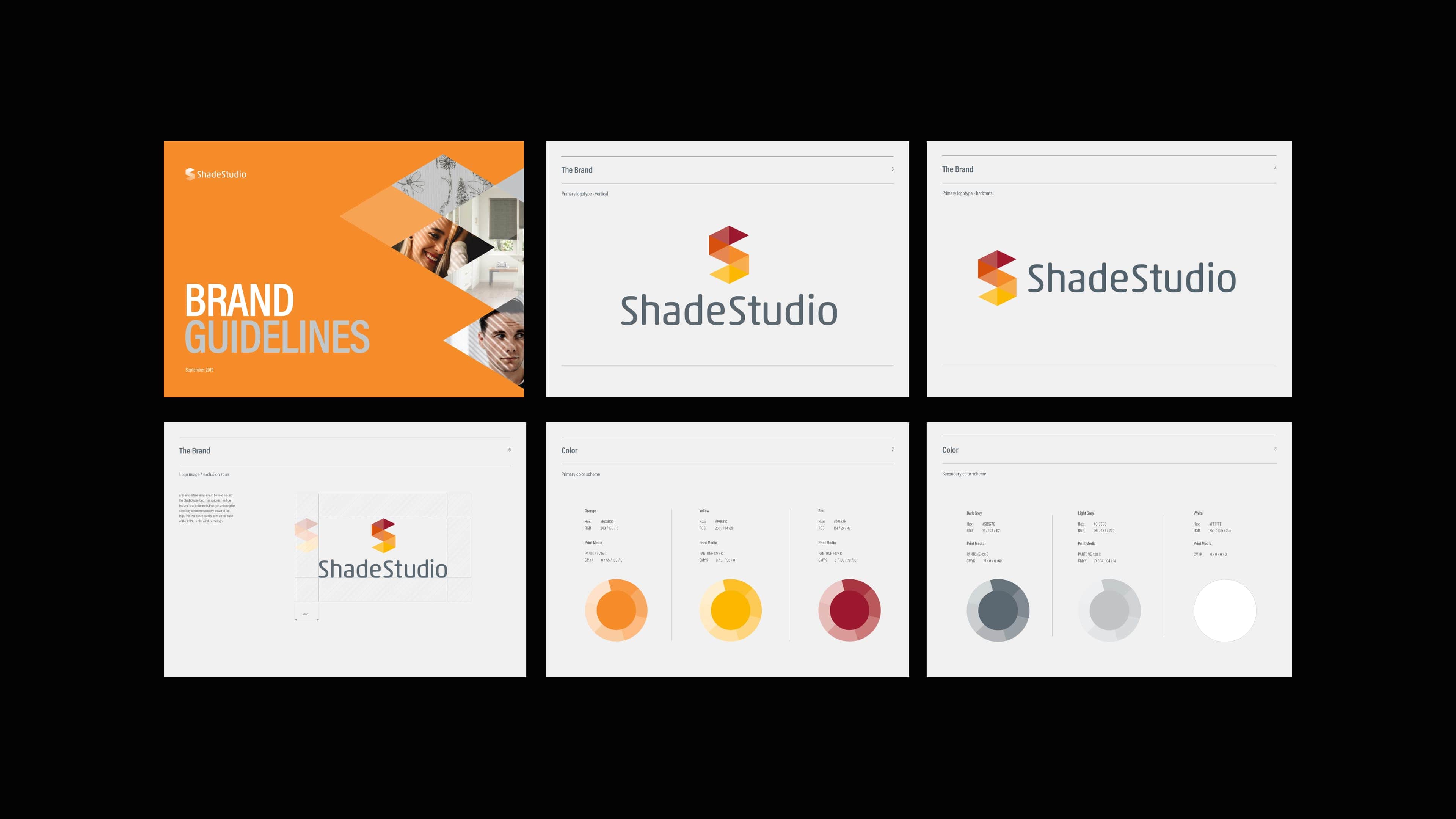
Our brief was to bring this new organisation to life across all touch points - from the brand identity, print collateral and the design of the visualisation products themselves. We used a powerful mix of classic branding, strategy and art direction alongside the latest UI/UX and motion applications to engage and energise customers both online and in traditional showrooms.
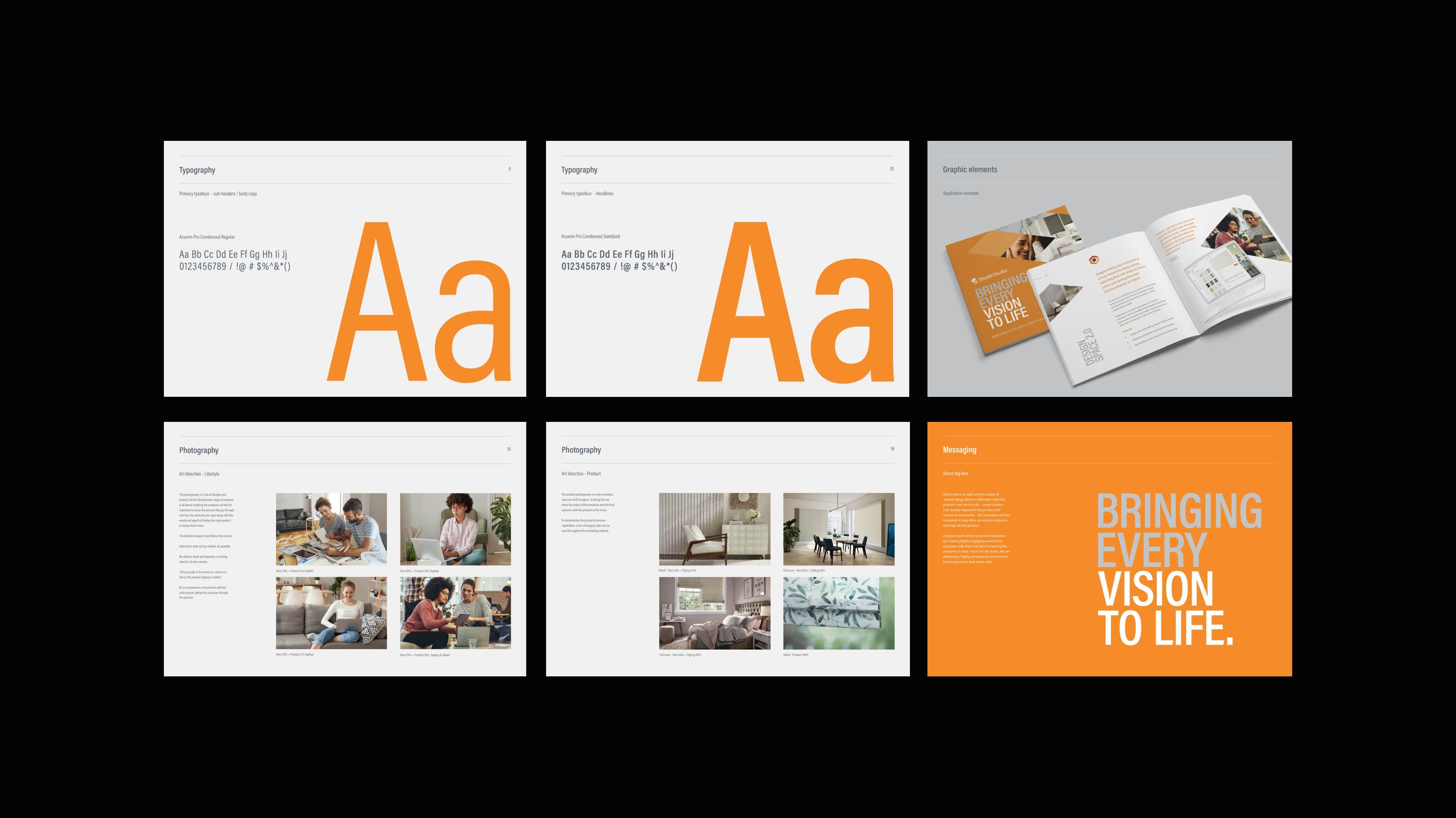
The visual identity had to sit alongside the main Hunter Douglas brand so we ensured that the design cues were maintained through the colour palette and the typography. Apart from that a new design language could be created to fully express the brand and the eventual suite of products that would be created.
We focused the brand strategy around the concept of 'vision' and and the action of ‘seeing’ things which is ultimately what the products and services do. This strategy resonates with the consumer to help drive an emotive response by immersing them in their ‘vision’ for the home, and ultimately helps to sell the product. Based on this we created the brand tag line of 'Bring every vision to life'.
CONNECTING CUSTOMERS AND CONSUMERS ASPIRATIONS
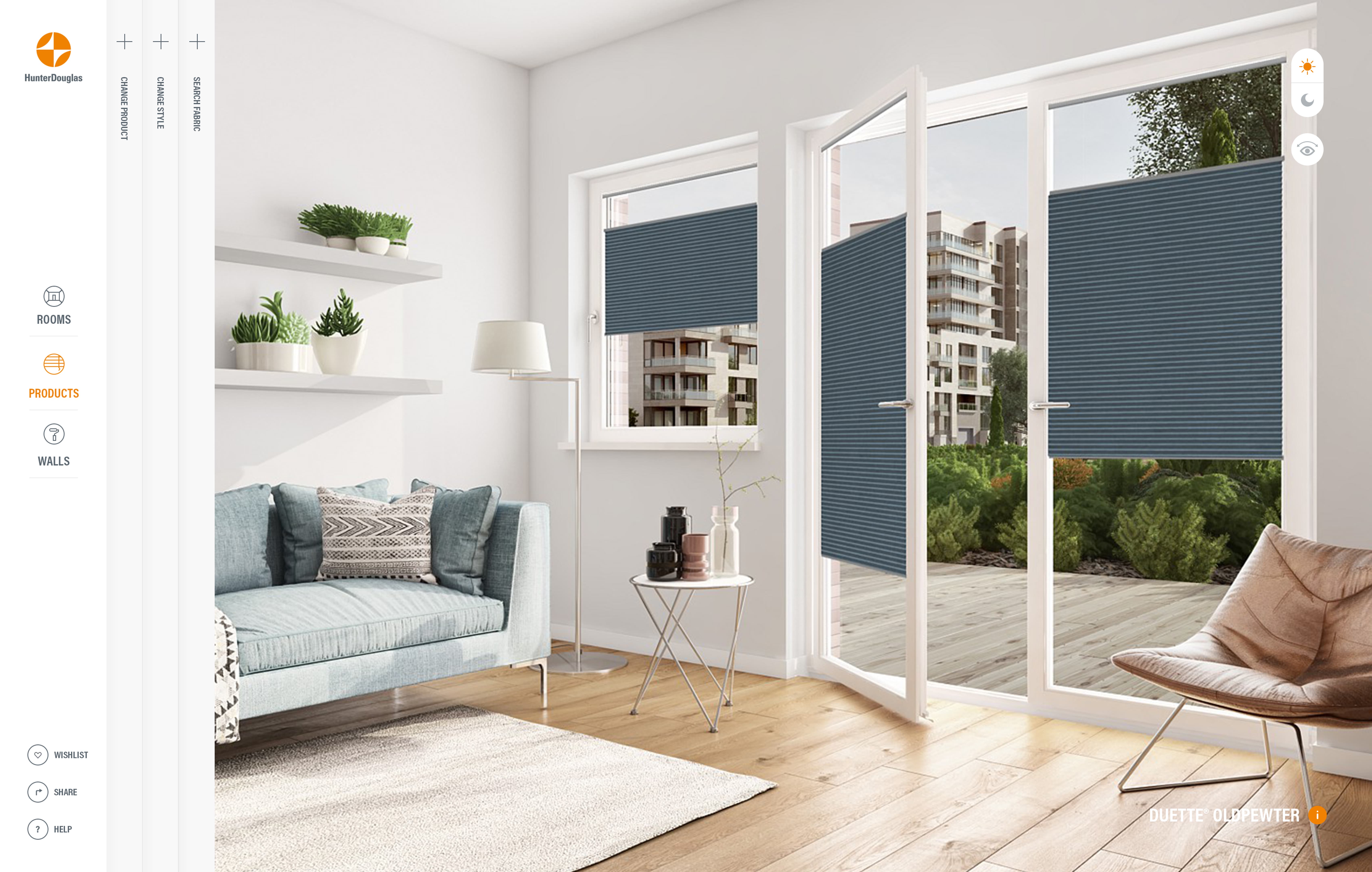
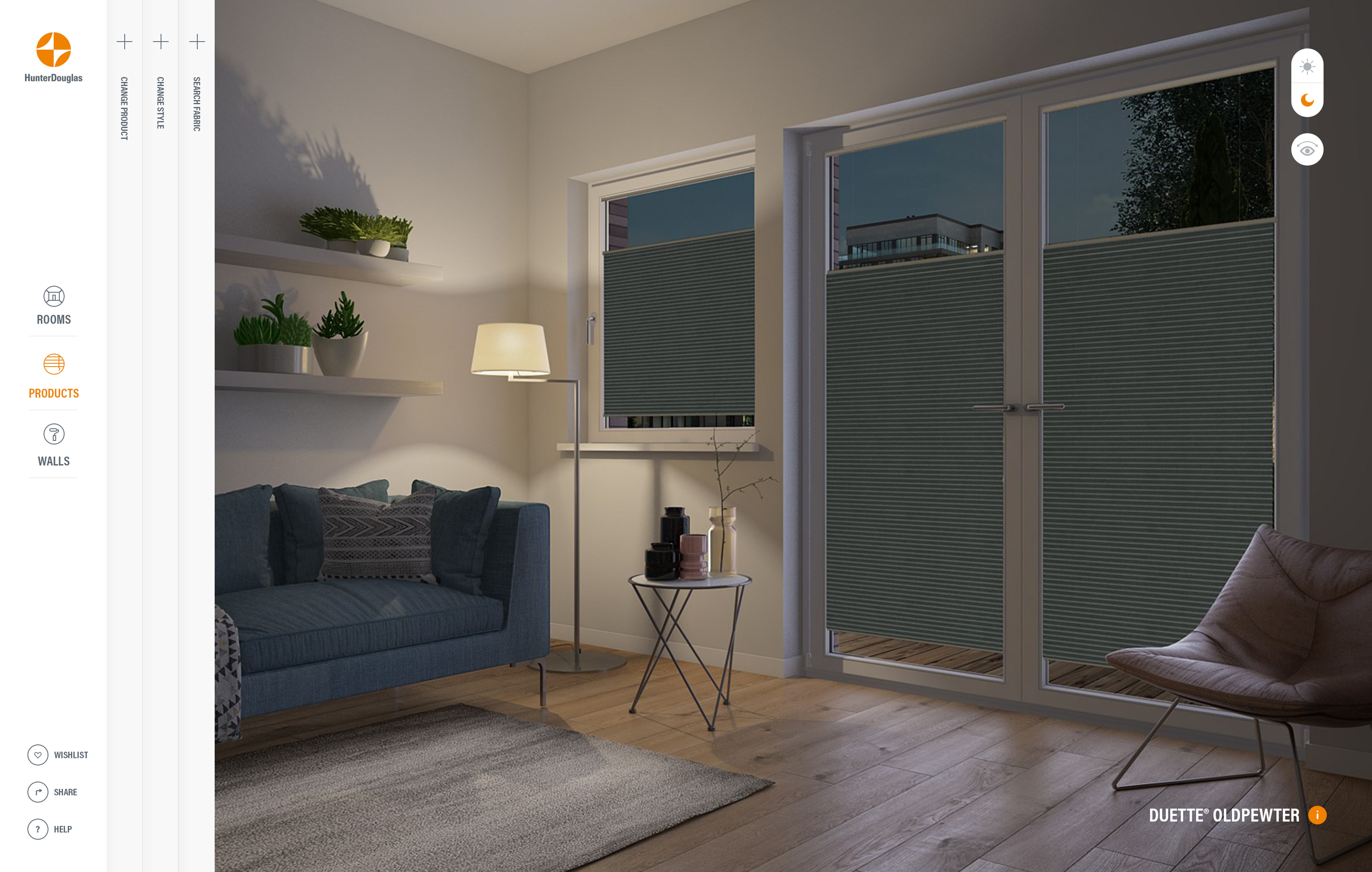
The first product we helped bring to life was Design Space - an online configurator that allows the placement of unique product ranges in inspirational room scenes either from the showroom or in the comfort of the home. This new digital platform would be the hub of a new eco-system of products and had to support the sales activities of in-store and online dealers. At the same time the system had to capture valuable insights into the customers shopping behaviours and guide them into the sales funnel.
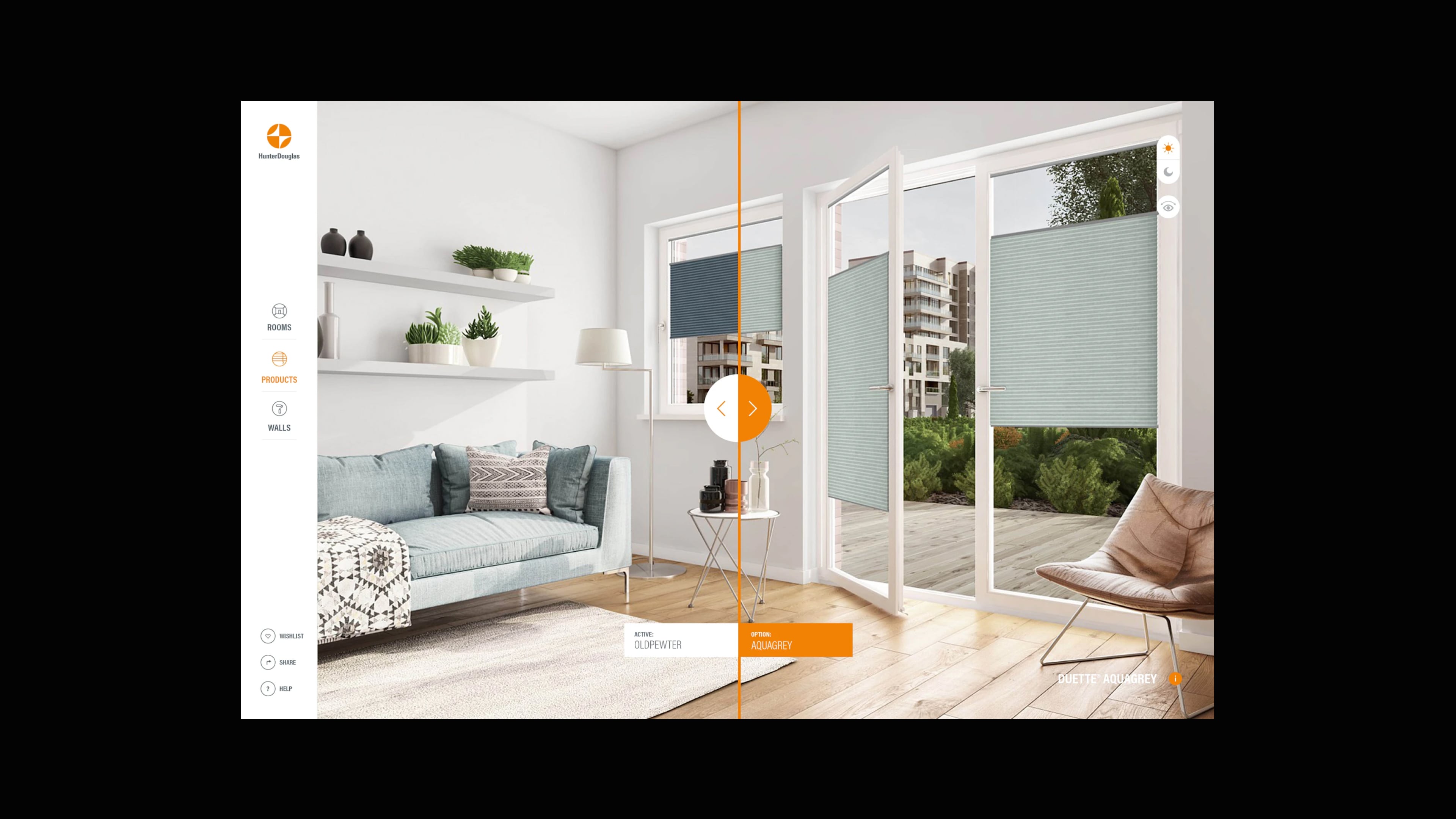
The system would guide the user through the selection of their window blinds in environments based on their own preferences. They could customise an entire room set from the wall colour right down to the type of flooring. Our guiding UX principles were to inspire, educate and share - which enabled Hunter Douglas to demostrate their products in an engaging way without the audience feeling like they were being marketed to.
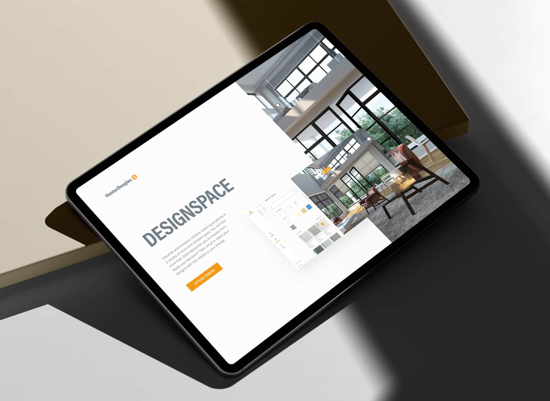
DESIGN SYSTEM
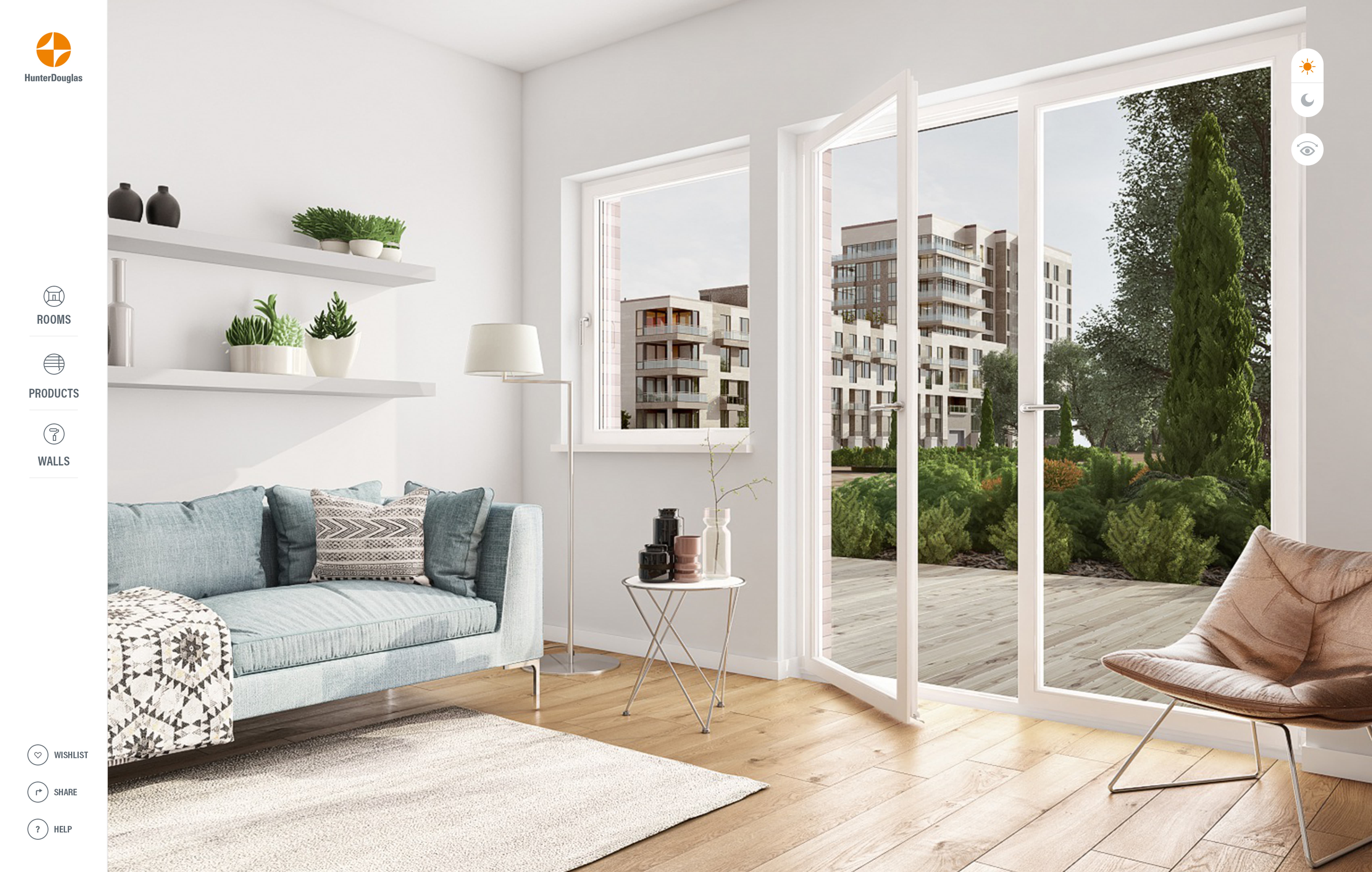
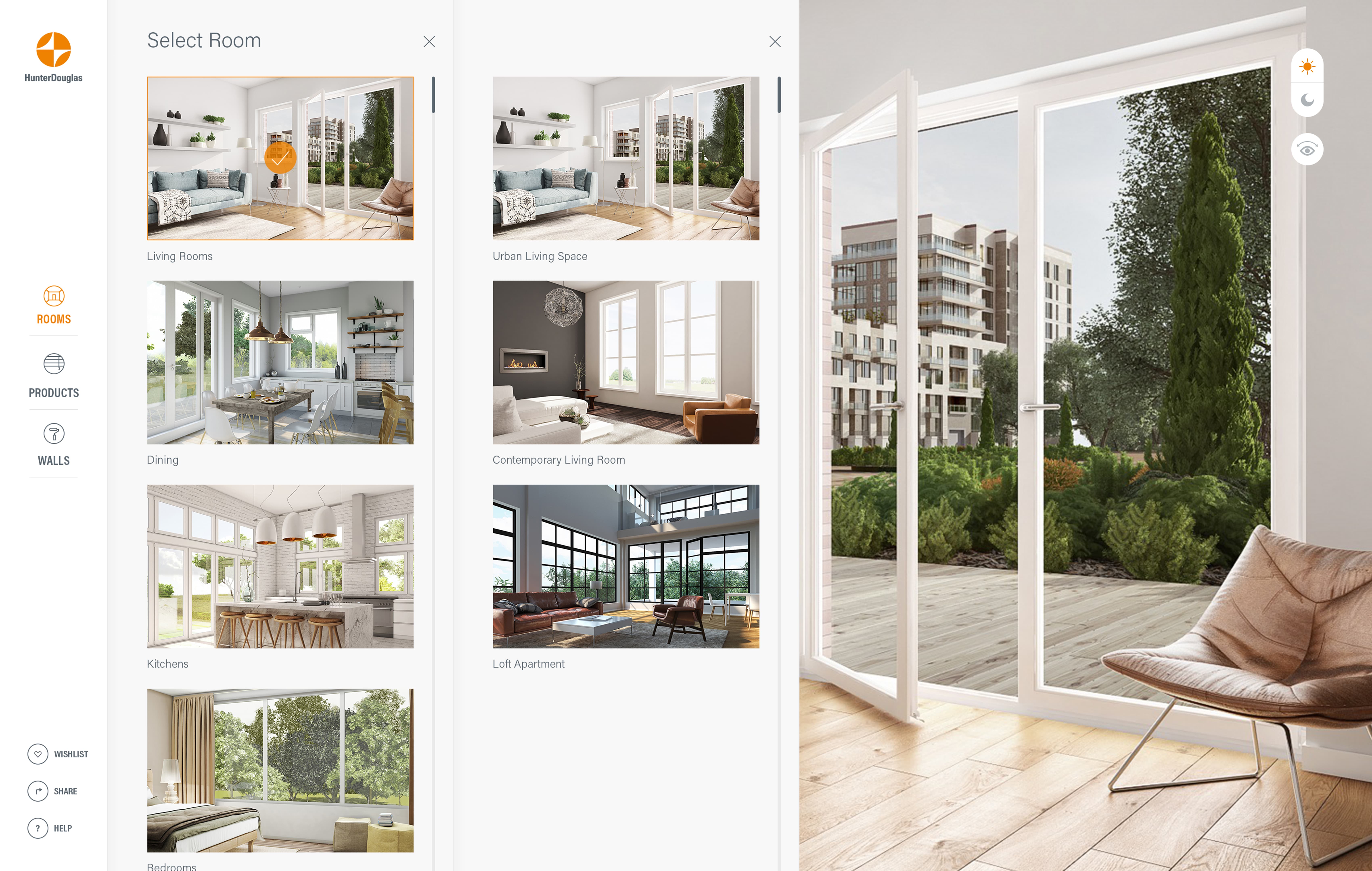
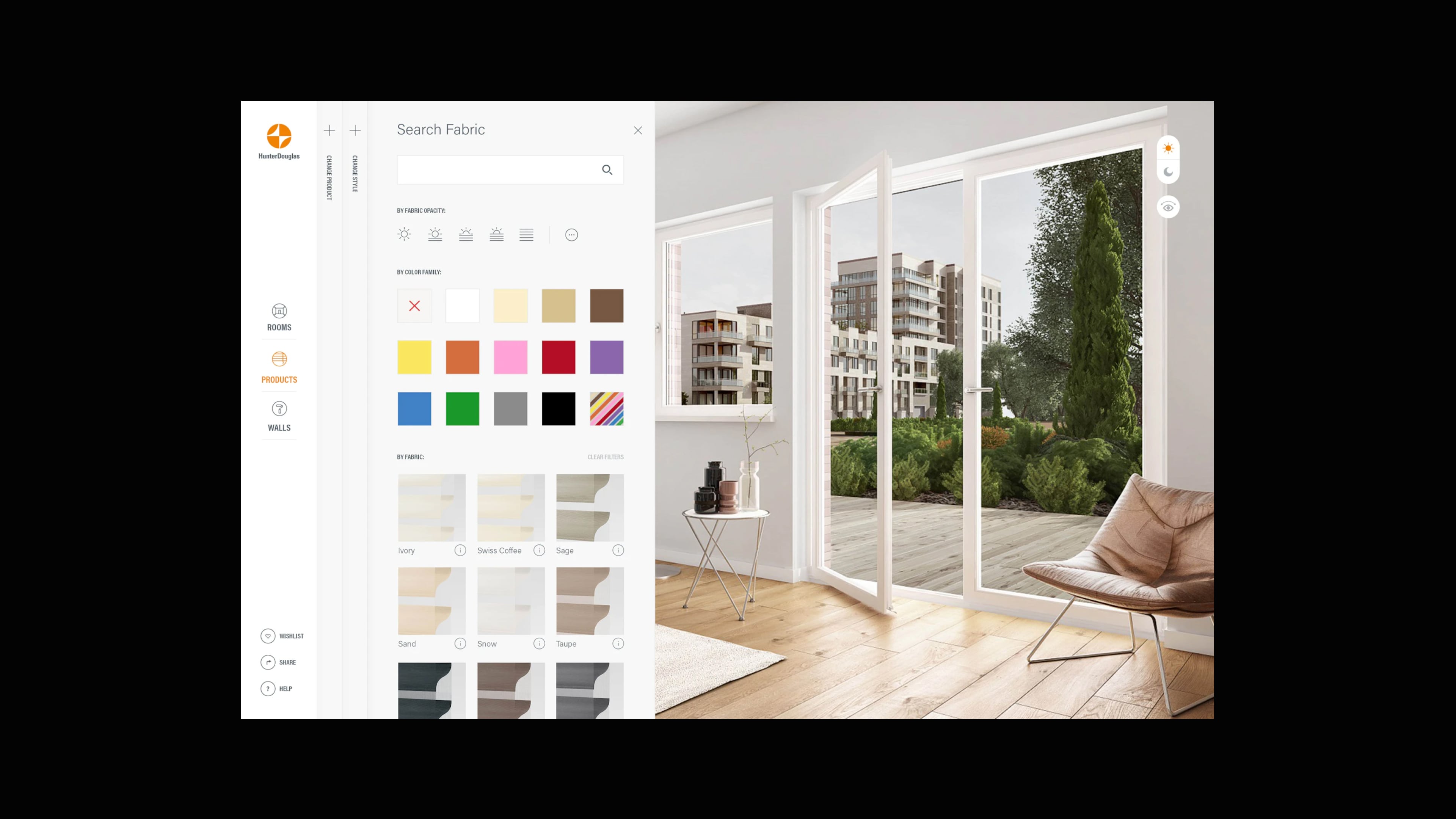
The user would be inspired through an extensive library of configurable room assets creating a room in their own home or to create something completely different. Each product has its own story to tell, so we wanted to bring them to life with in-depth information, from the unique fabric properties, operating systems to installation. And finally the user can export their configured room set and email it to themselves or share via social media.
OPTIMIZED FOR MOBILE
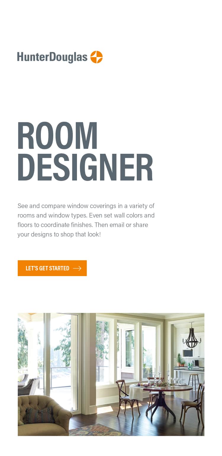
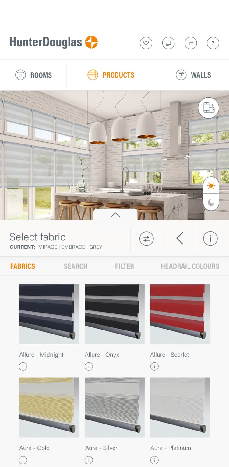
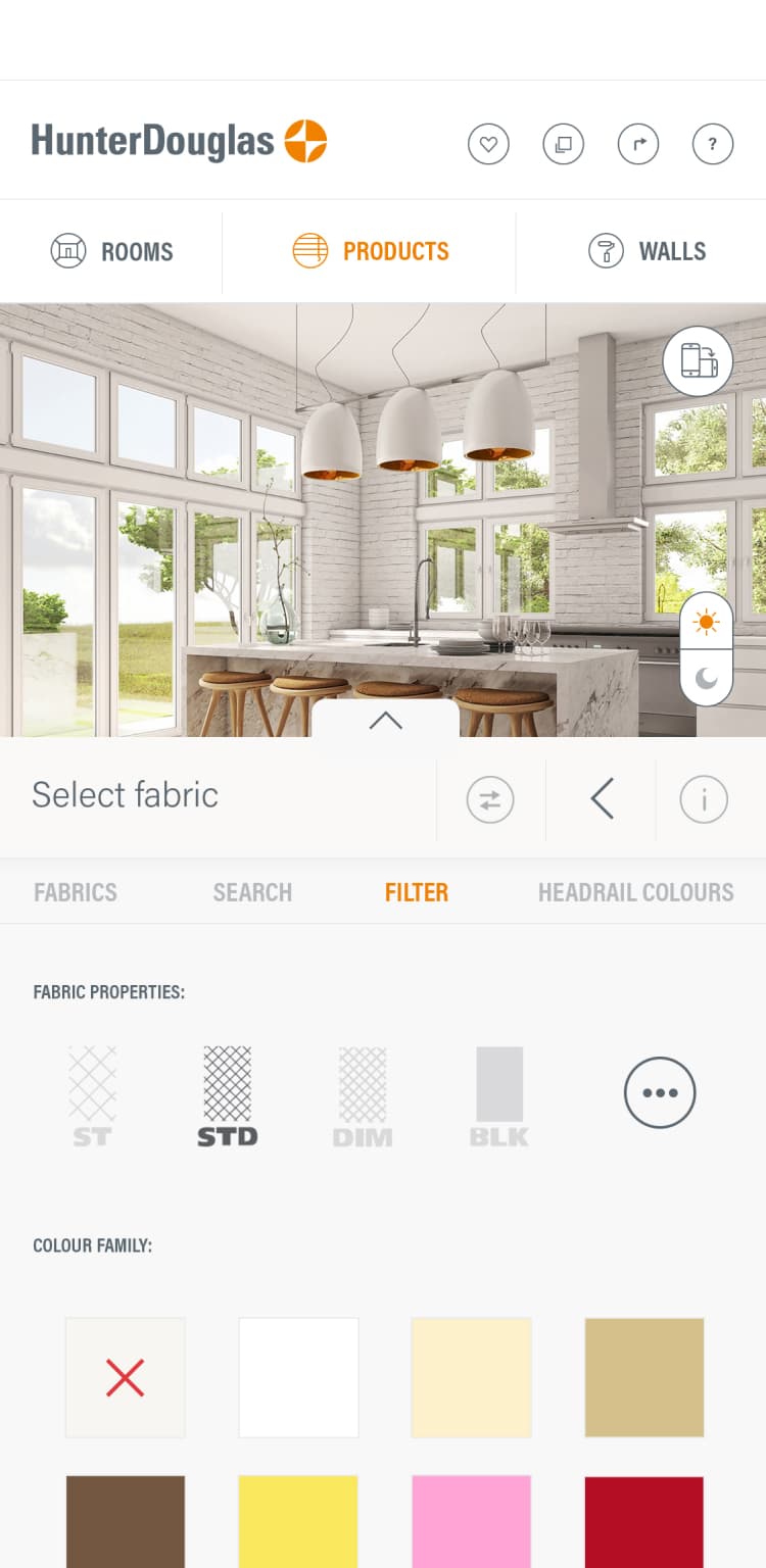
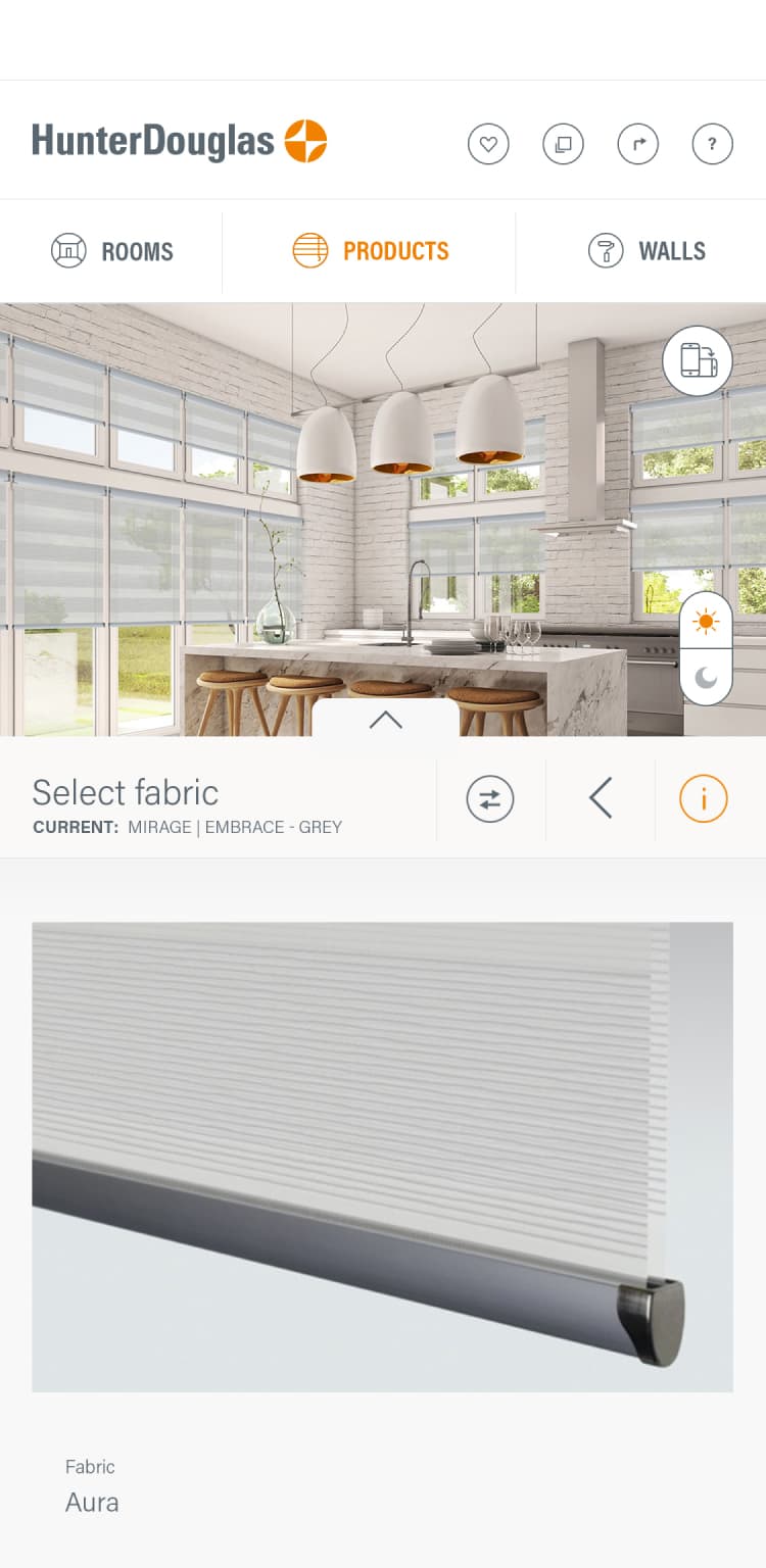
As with any of our projects we always aim to deliver an equally engaging experience across all devices. With this project we had the challenge of creating an equally immersive experience on much smaller screens, something which can be very difficult for configuration systems due to the sheer amount of content and functionality that needs to be displayed. Instead of simply creating a responsive system we set out creating an entirely new design system for mobile devices which would mean that the entire experience and content is tailored for that device and ensuring that their was no cognitive overload to the user.
ADOPTING AN ECOMMERCE APPROACH
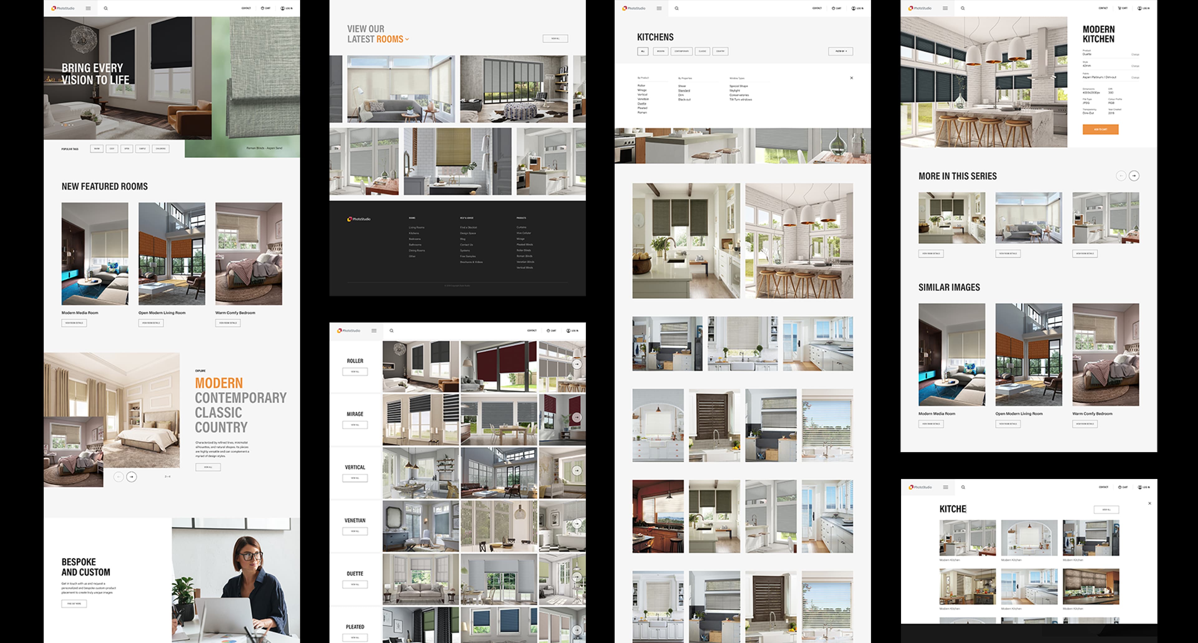
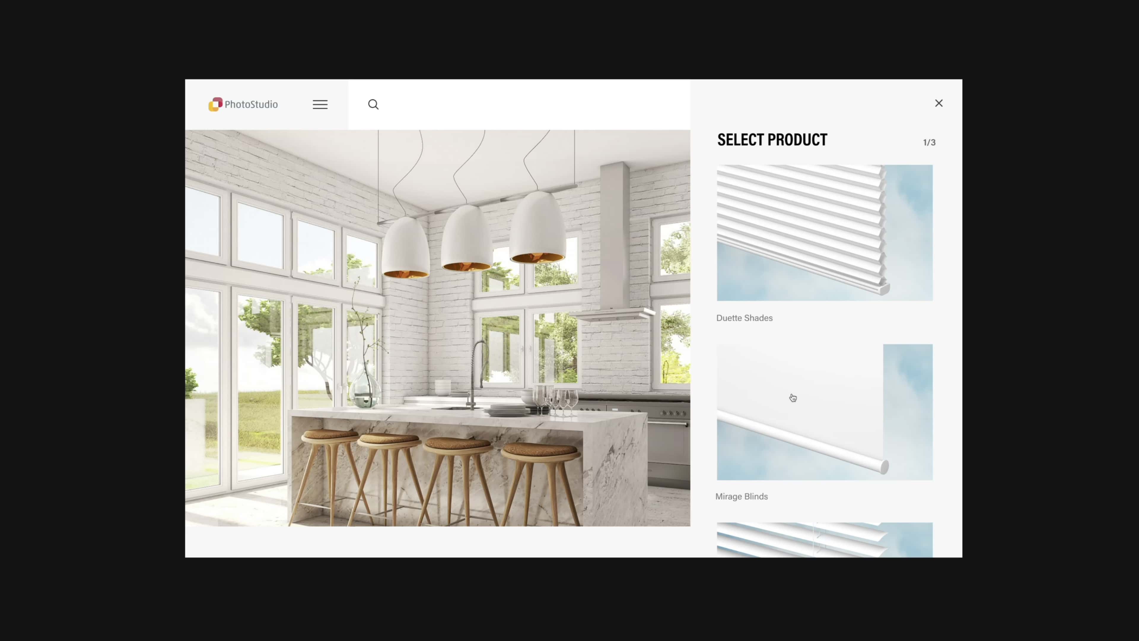
Leveraging the technology that was developed for Design Space our next project was the creation of a tool to support the dealer network and marketing activities. The online tool would be an image library designed for customers, giving them the required assets to market themselves to consumers. Unlike standard image libraries the user can access state-of-the-art rendering and customise them based on their own requirements. Different blinds can be placed in room scenes along with customising the colour and even fabric patterns to create unique content quickly. Our brief was to design the entire digital experience from the customer journey, site architecture, UI and motion.

GUIDING THE AUDIECNE ACROSS THE EXPERIENCE
To make the user experience as simple as possible we adopted a 'guided' layered navigation paradigm along with functionality more typically found in ecommerce sites such as filter systems and a cart function. These well-known features resonated well with the users and aided in the tool being quickly adopted by new customers. To further enhance the user experience we also built in modules to support progressive personalisation. Based on your image selection and browsing behaviour the site would deliver highly curated content at different points in the user journey.
