Verity Studios
- Strategy
- Digital
- Development
- Motion
- AWWWARDS
- SITE OF THE DAY
- DEVELOPER AWARD
- MOBILE EXCELLENCE
- CSS DESIGN AWARDS
- SITE OF THE DAY
- UI DESIGN AWARD
- UX DESIGN AWARD
- INNOVATION AWARD
- COMMUNICATION ARTS
- WEB PICK SITE OF THE DAY
- NET MAGAZINE
- WEB SITE FEATURE
Spectacular. Awe-inspiring. Verity Studios indoor drone shows bring a new level of excitement and technical excellence to live events.
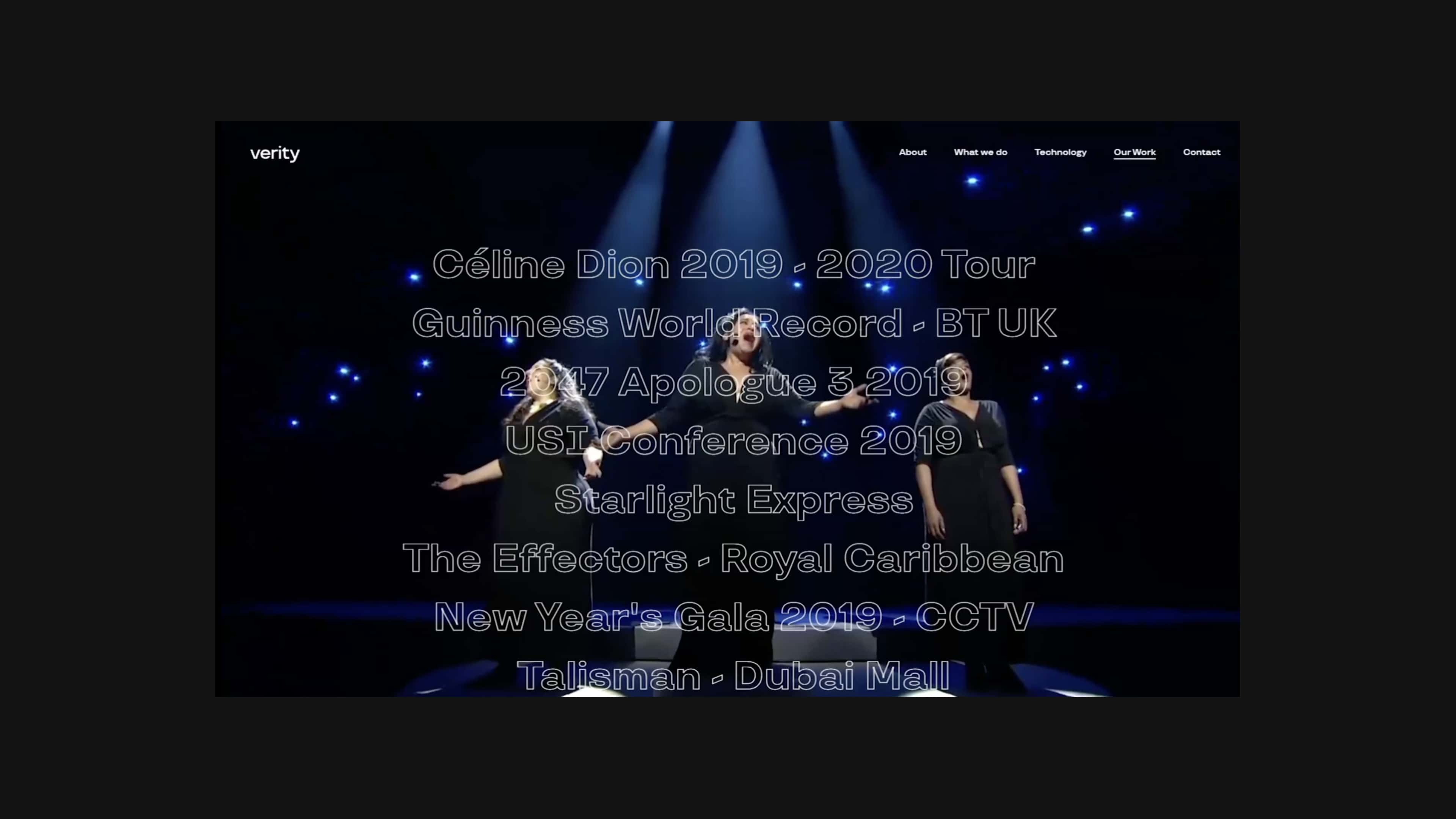
What Verity create is truly ground-breaking, so their new website needed an identical ‘wow’ factor – with a user experience as rich and immersive as the shows themselves. To live up to the vision, and capture the ‘wow factor’, we had to make sure the user experience was as rich and as dynamic as possible – using immersive techniques, micro-interactions, thought provoking imagery and emotive, yet authoritative, narrative.
Uncovering the magic moments
During workshop sessions, we identified that our target audiences would be prominently within creative industries such as show directors, creative directors and events managers. To resonate with these groups, we wanted to bring to life the idea of a ‘magic moment’ and show how Verity could bring that magic to any event. To do this, we mirrored Verity’s own blend of art and technology to immerse the visitor in the experience. However, we were also conscious that the website had to work as Verity’s main commercial and recruitment platform. So the interactive features and rich media that gave the site its identity had to offer seamless UX performance.
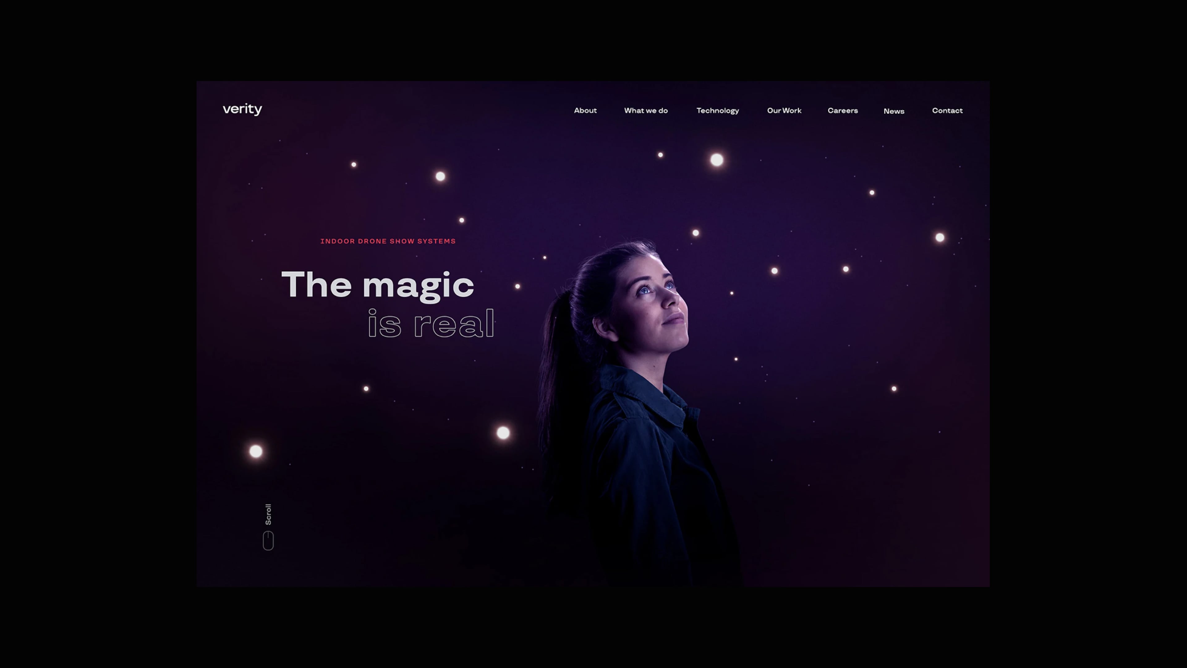
Behind the magic
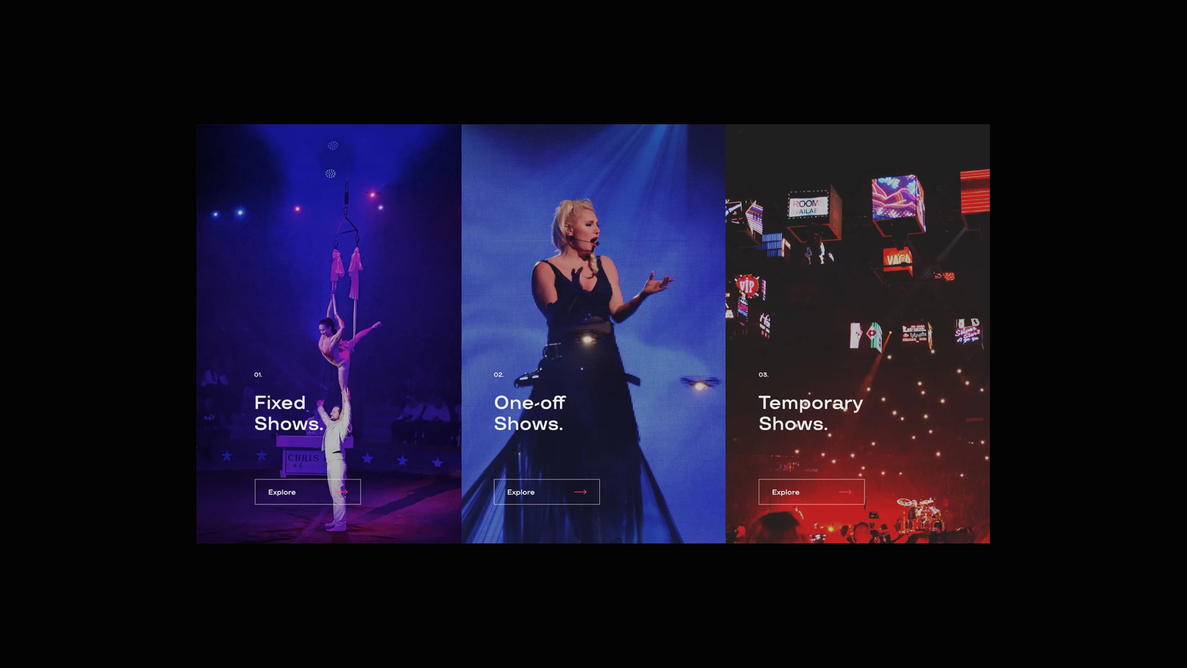
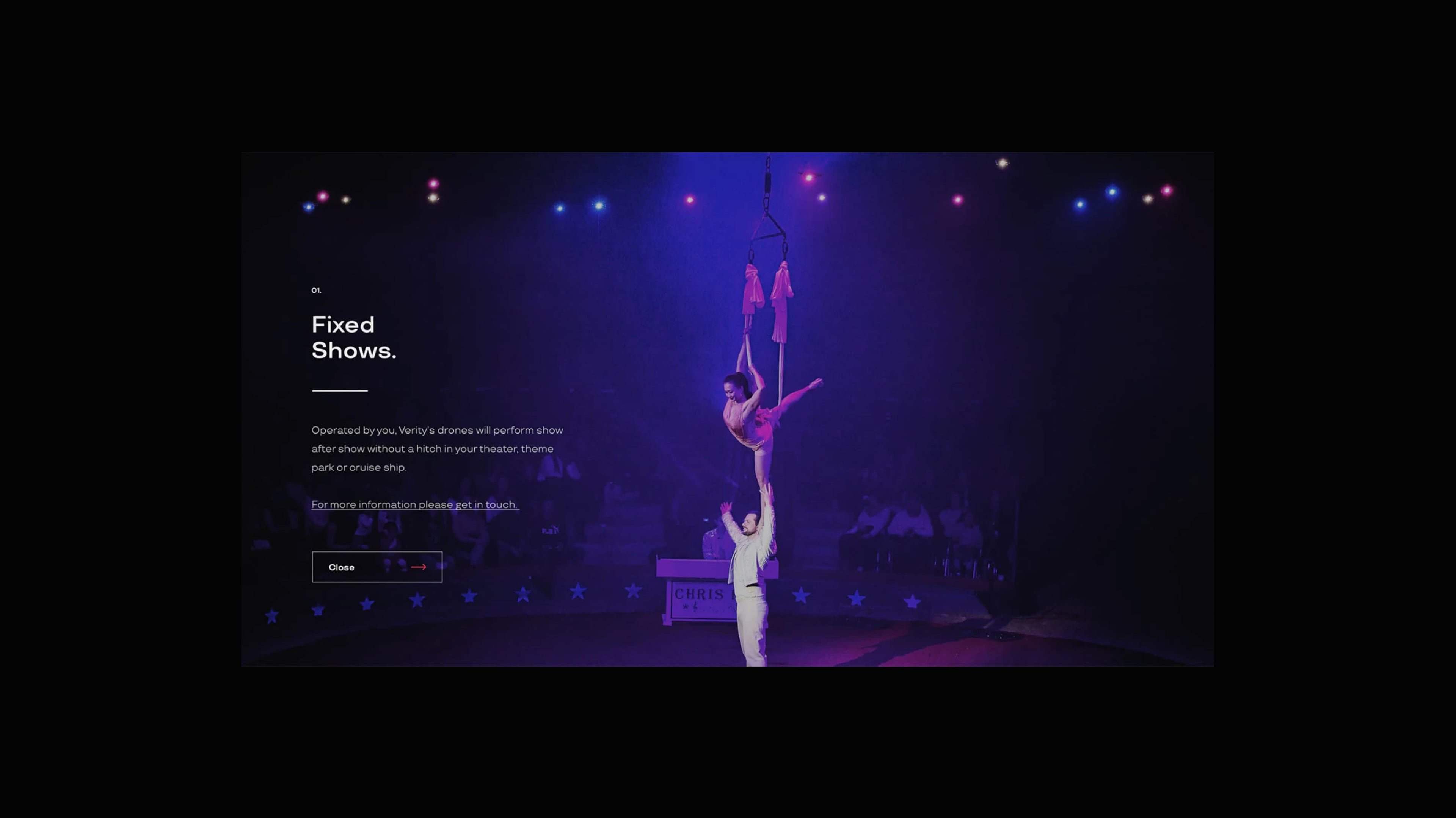
Very early in the design process we knew we had to show the drones in action to help people fully appreciate the technology and spectacle – which meant we had to incorporate video into the design. For our overall design language, we took visual inspiration from the atmosphere of the events themselves.
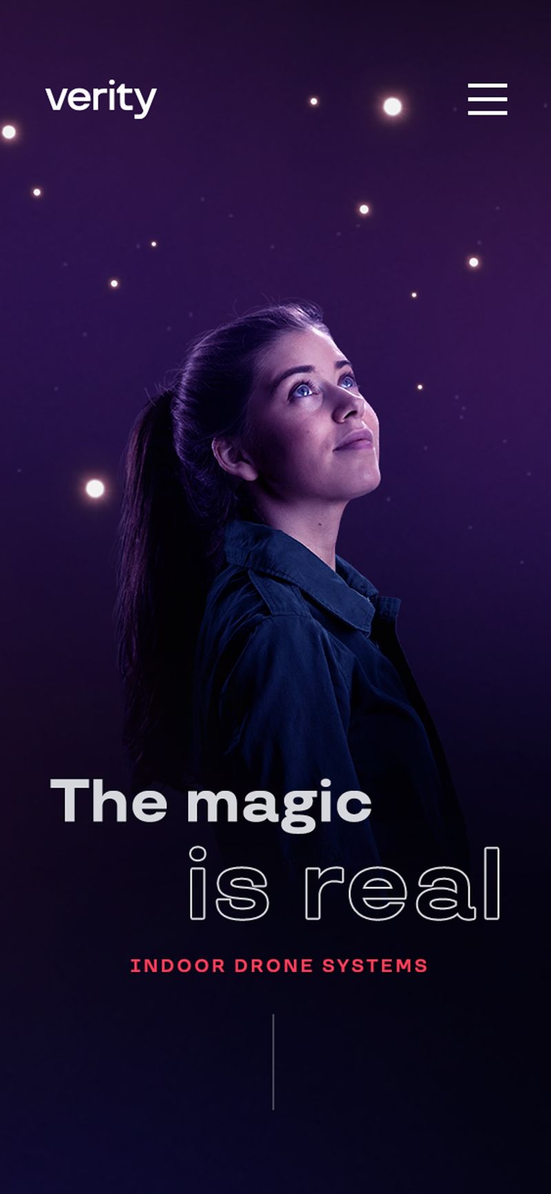
Along with the videos from the events we wanted to communicate the story through interactive design features. We used Three.js particle simulations to recreate the drone choreographies on the homepage, while integrating simpler particle systems into the site’s other page headers to give a complete visual language. To add further depth to the homepage, and to make it look like an integrated design, we also added light effects to the image of the model and smoke effects. Along with the WebGL elements we implemented more subtle interactions, page transitions and animations along with parallax scrolling functionality throughout the site.
FUTURE PROOFING
One of the most challenging aspects to the project was trying to get the balance between an experience that was both feature-rich and robust enough to support the commercial needs of the business in the future. To make sure the site was resilient enough for this future growth, we used a content-focused CMS called Prismic for the back-end as we felt this system would meet the short- and long-term needs of the business and fully support the front-end design.

Optimized for mobile
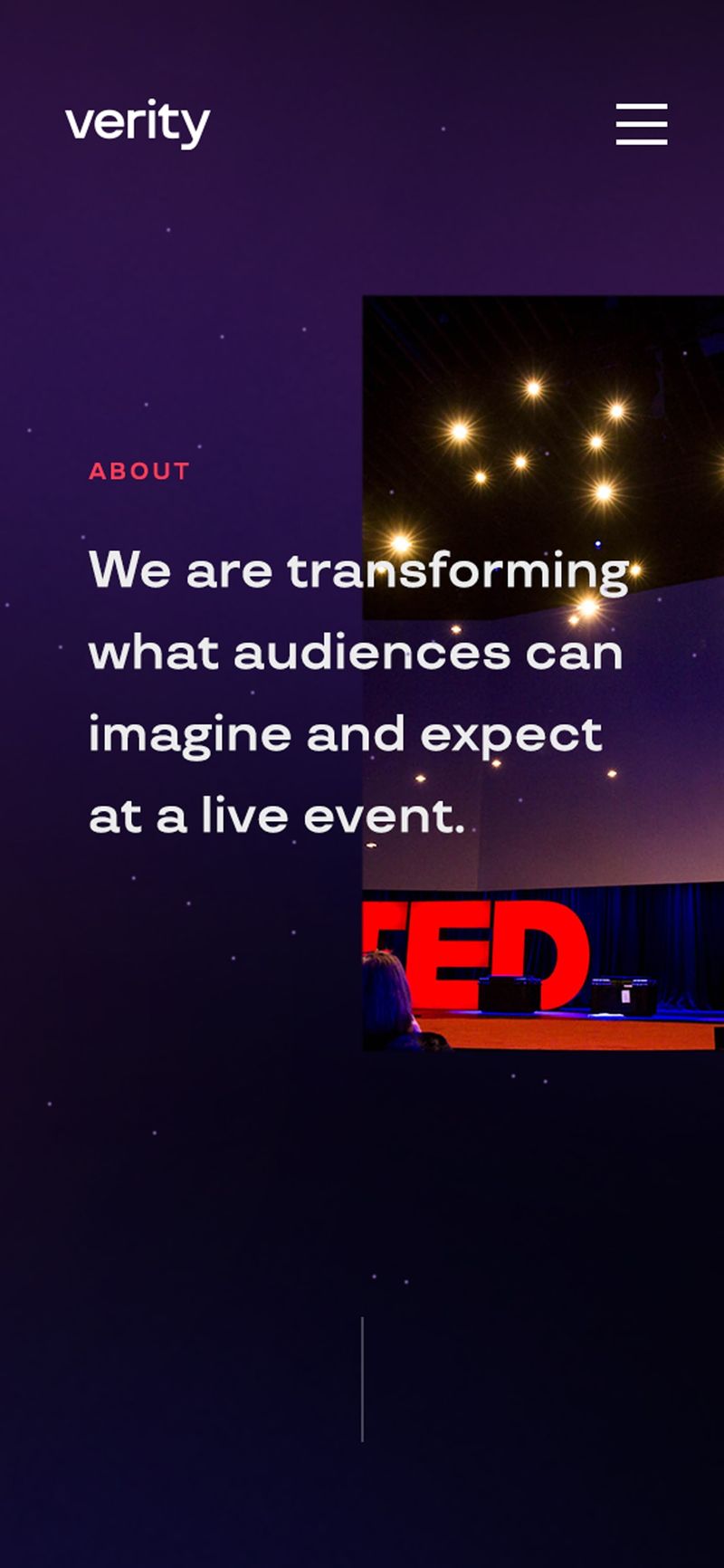
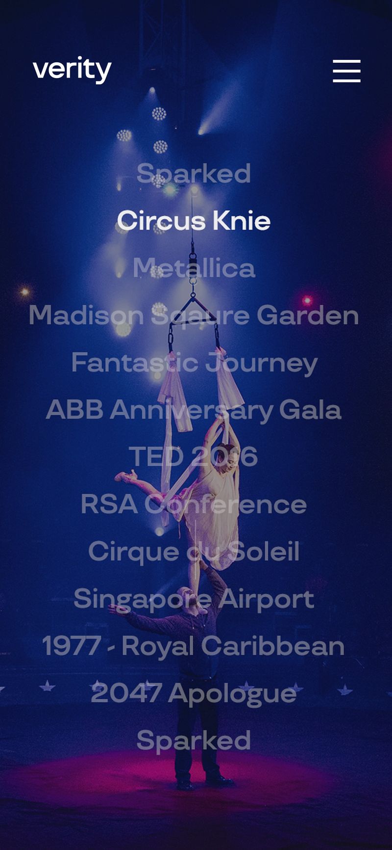
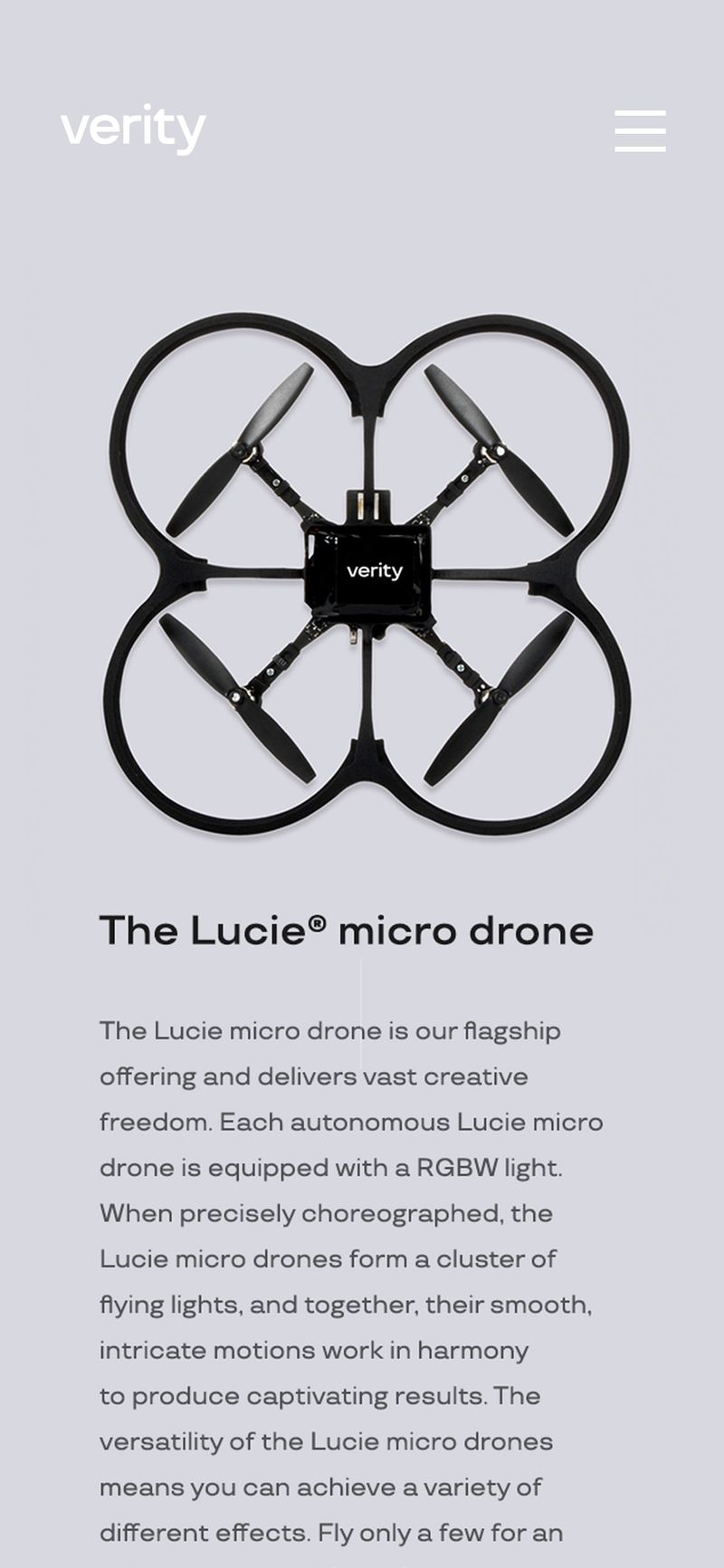
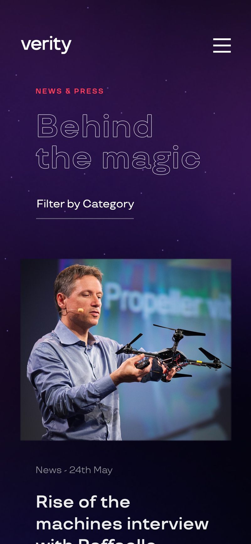
With all our projects we always aim to create equally immersive experiences on all screen sizes — but, in our partnership with Verity Studios we made a point to prioritise our design system to be stunning and seamless across mobile devices. This was made ever more challenging with the amount of video content on the site, however we managed to optimise the experience to ensure it was extremely mobile friendly.
