Aston
- Strategy
- Brand
- Digital
- Development
- Motion
- AWWWARDS
- SITE OF THE DAY
- DEVELOPER AWARD
- MOBILE EXCELLENCE
- HONOURS
- FWA
- SITE OF THE DAY
- CSS DESIGN AWARDS
- SITE OF THE DAY
- UI AWARD
- UX AWARD
- INNOVATION AWARD
- SITE INSPIRE
- FEATURED SITE
- LANDBOOK
- FEATURED
Aston Currency Management are a foreign exchange firm who specialize in providing flexible and innovative ways to make payments from anywhere.
Aston Currency Management provide expert advice and facilitation of multi-million £-worth of currency transactions and exchanges. They came to Outpost requesting a total brand refresh and a new website which reflected their position as a trusted partner to their clients – and detailed their offering of tailored, technology-driven solutions matched to their clients’ specific needs.
Project Summary
- Brand strategy, positioning and identity creation
- Digital experience and identity now aligns to the servcie and differentiates from competition
- Increased efficiency to update and maintain the site internally
- Website supports and ligns with marketing and sales teams activities
- Integration with customer portals and CRM systems for sales teams
- 3 international awards and press coverage

Currency without limits
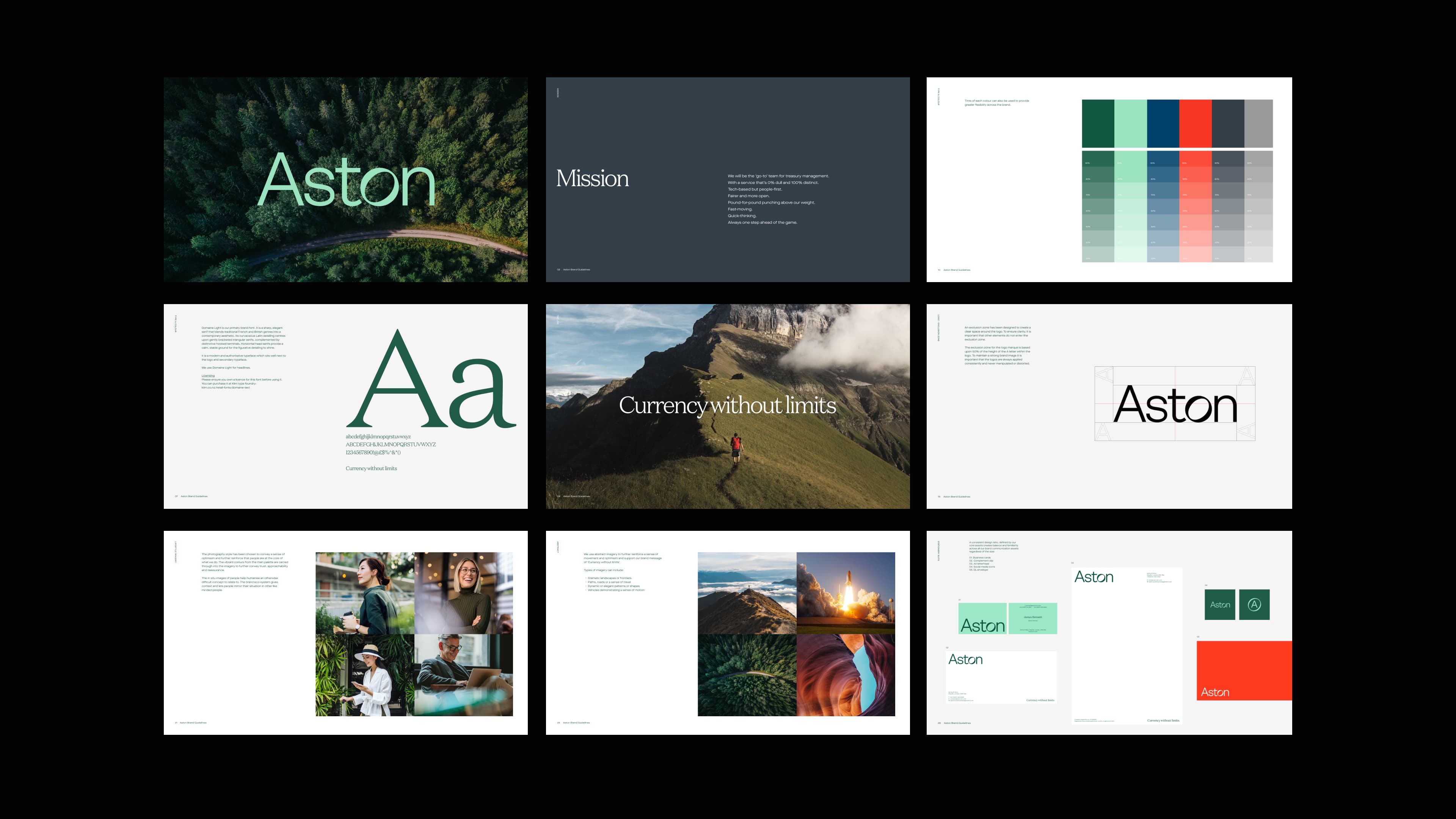
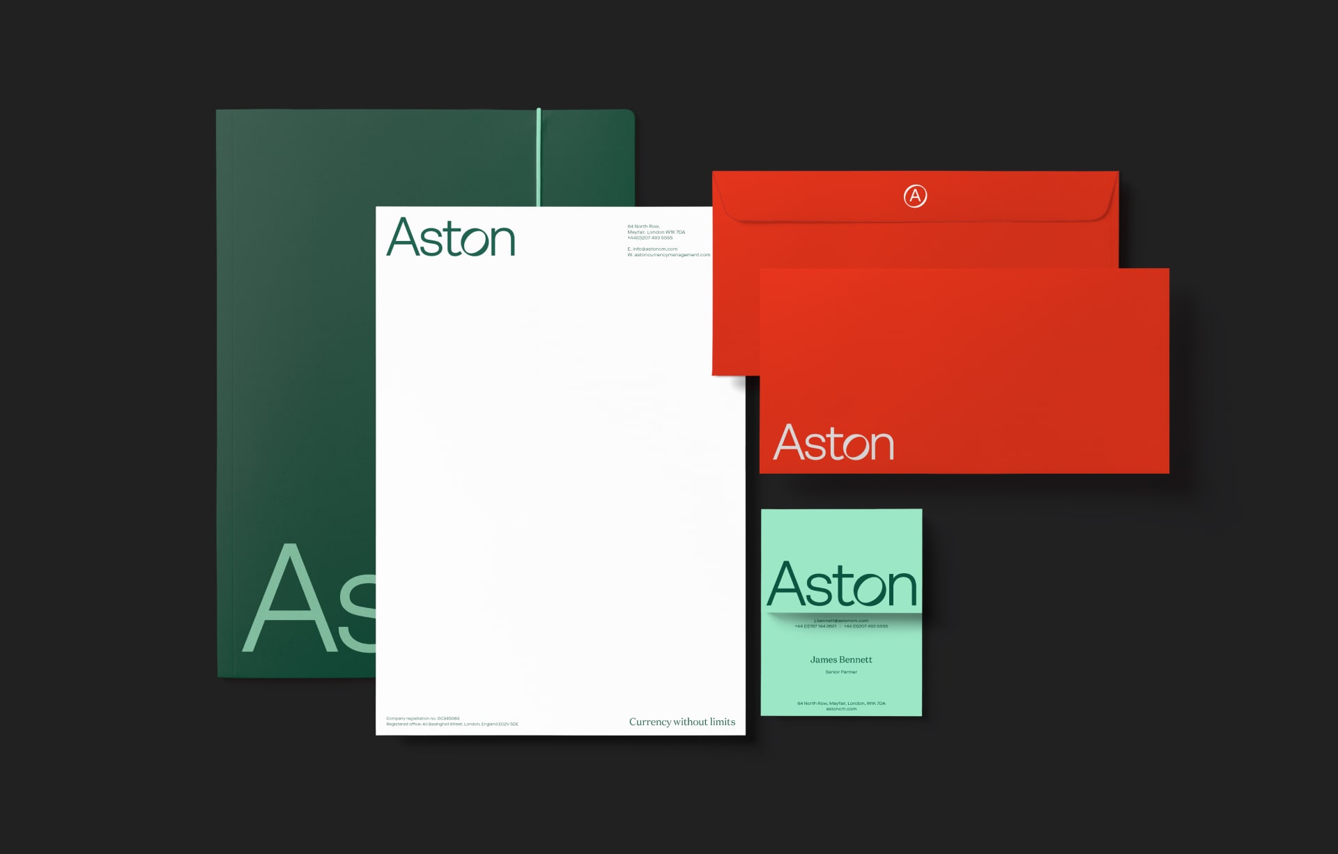
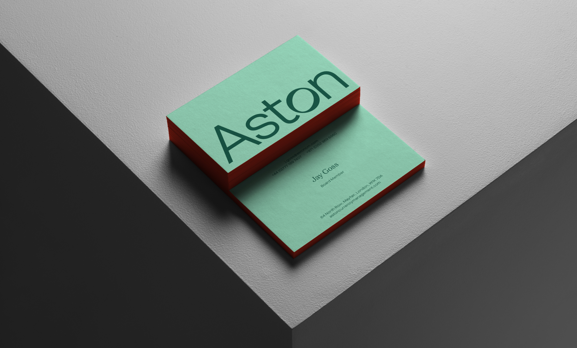
After completing a full brand review and collaborative workshops with the Aston team, we restructured the brand architecture to bring it up-to-date and reframe the Aston offering as a truly premium experience. The logo became sleeker, more modern and distinctively more ownable. A new colour palette suggested calm, reassuring maturity and well-established resilience. Whilst a new supporting strap-line promotes confidence and has an optimistic, inspiring tone.
Results


We gave Outpost a brief for rebuilding our brand, website and all marketing materials. They quickly understood our requirements and were able to reflect our culture and ethos through a professional, modern looking brand promplty and on time.Jay Goss, Director

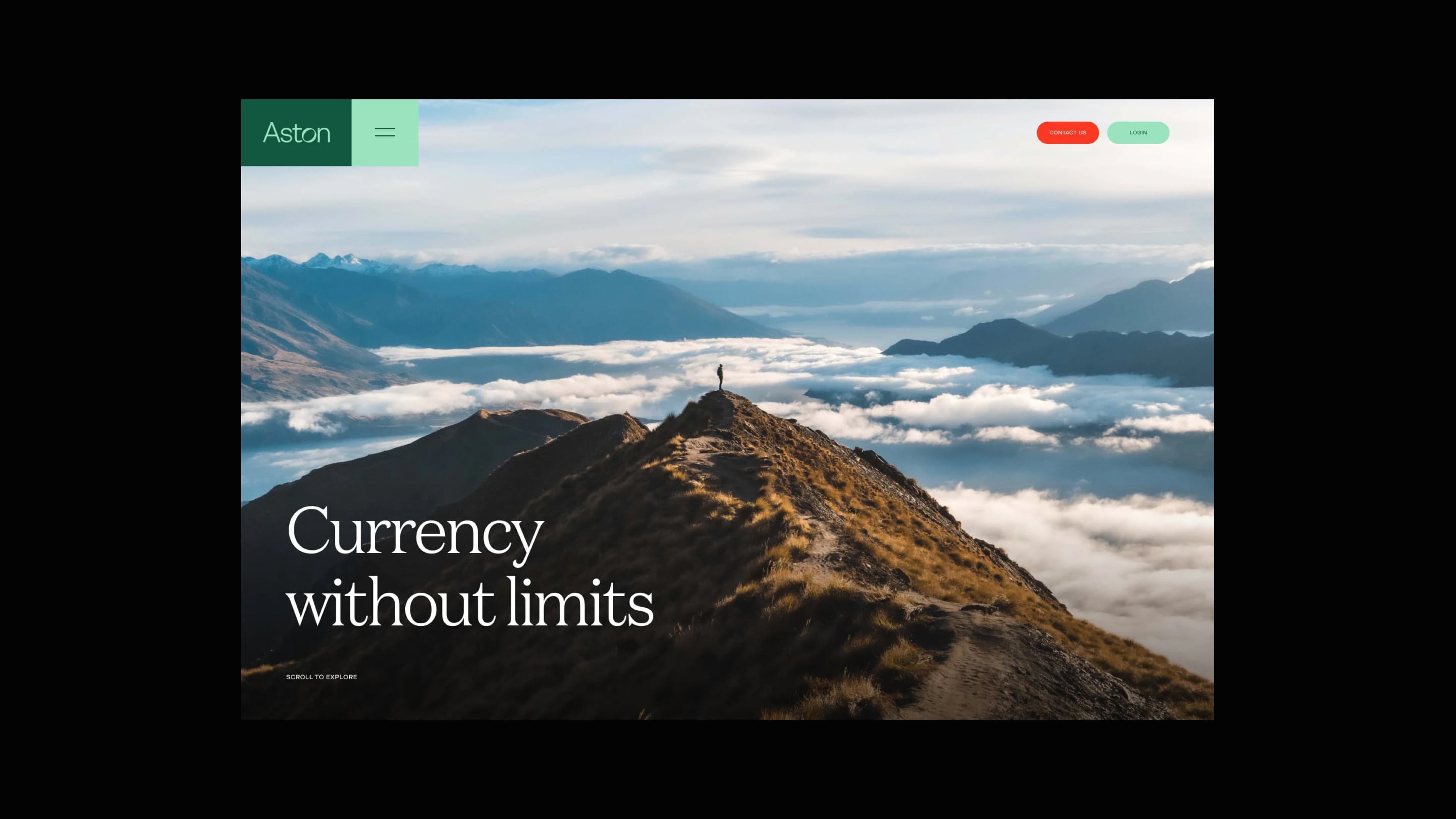
Creating a seamless guided experience
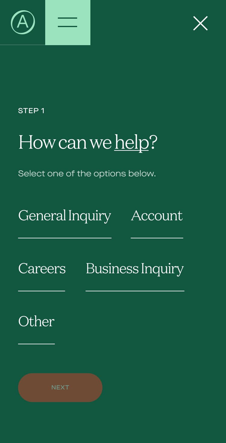
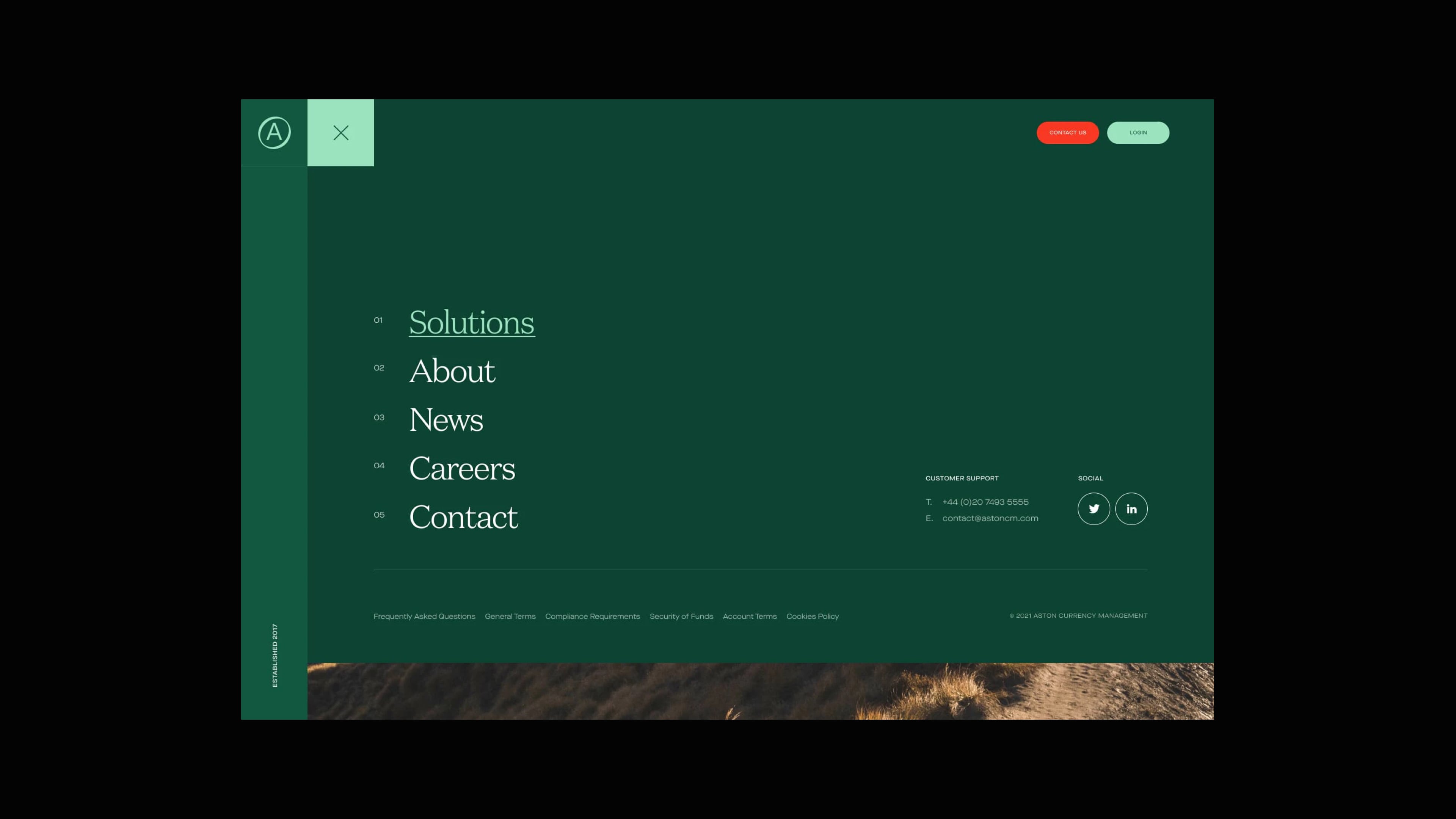
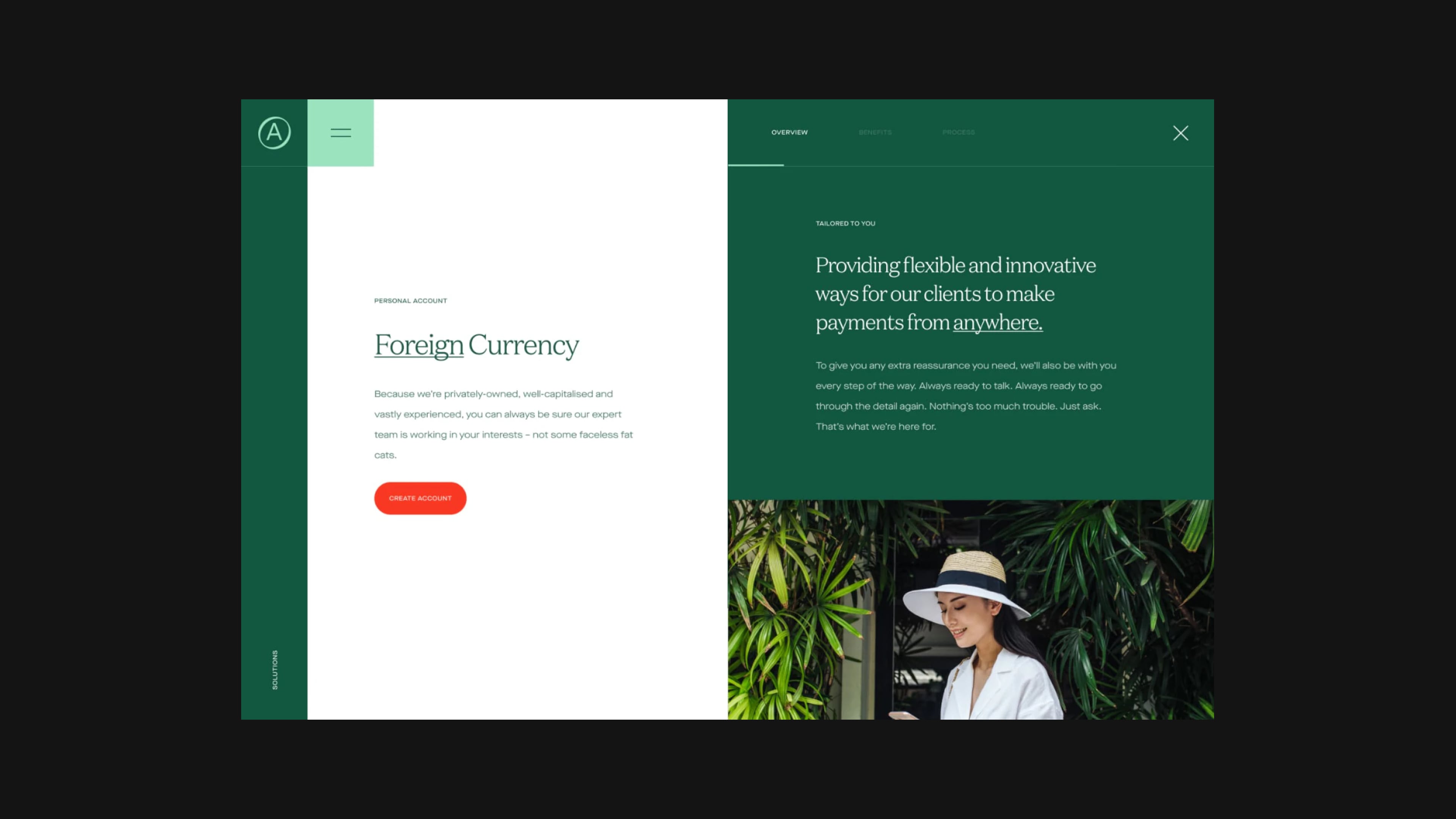
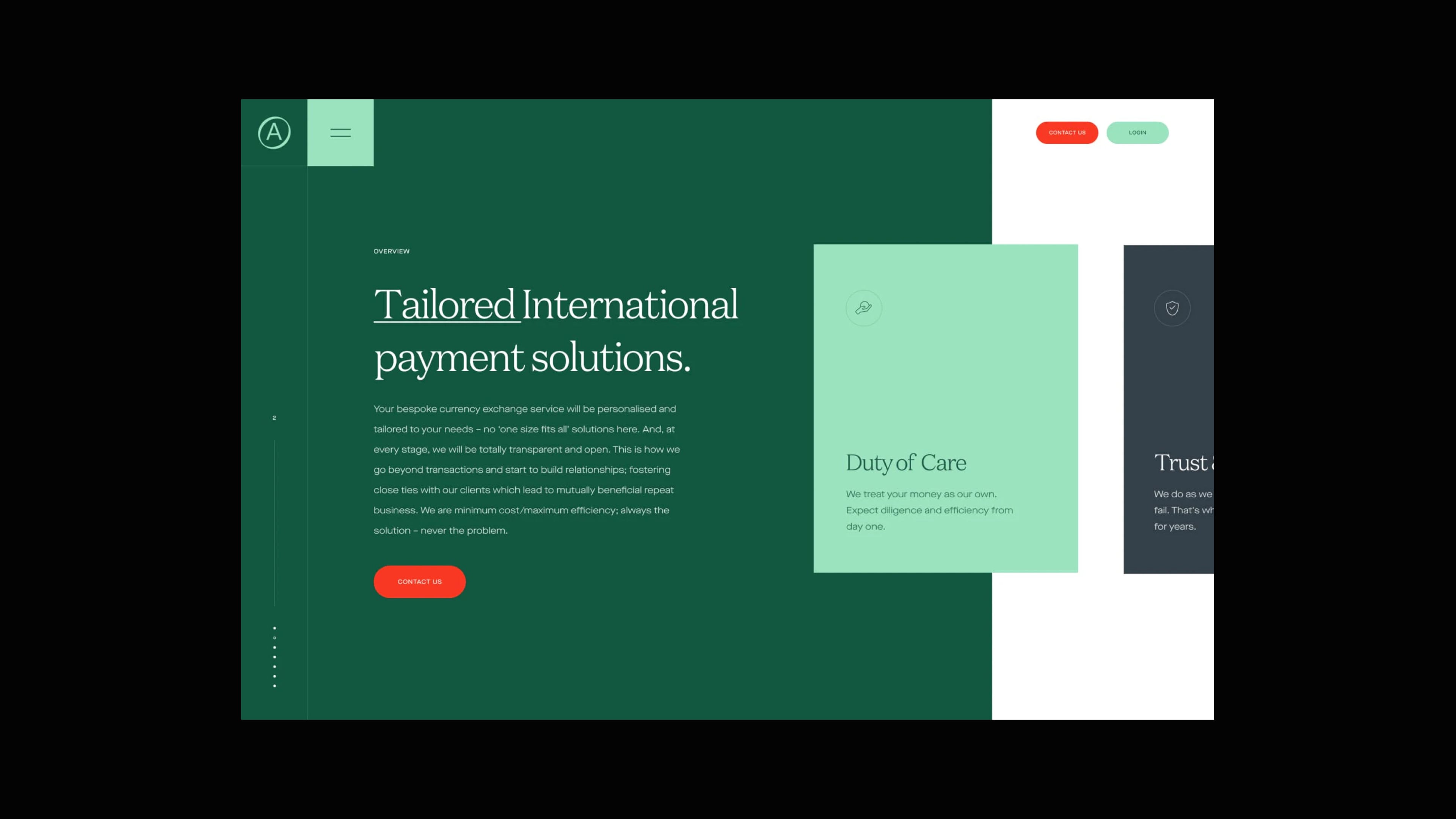
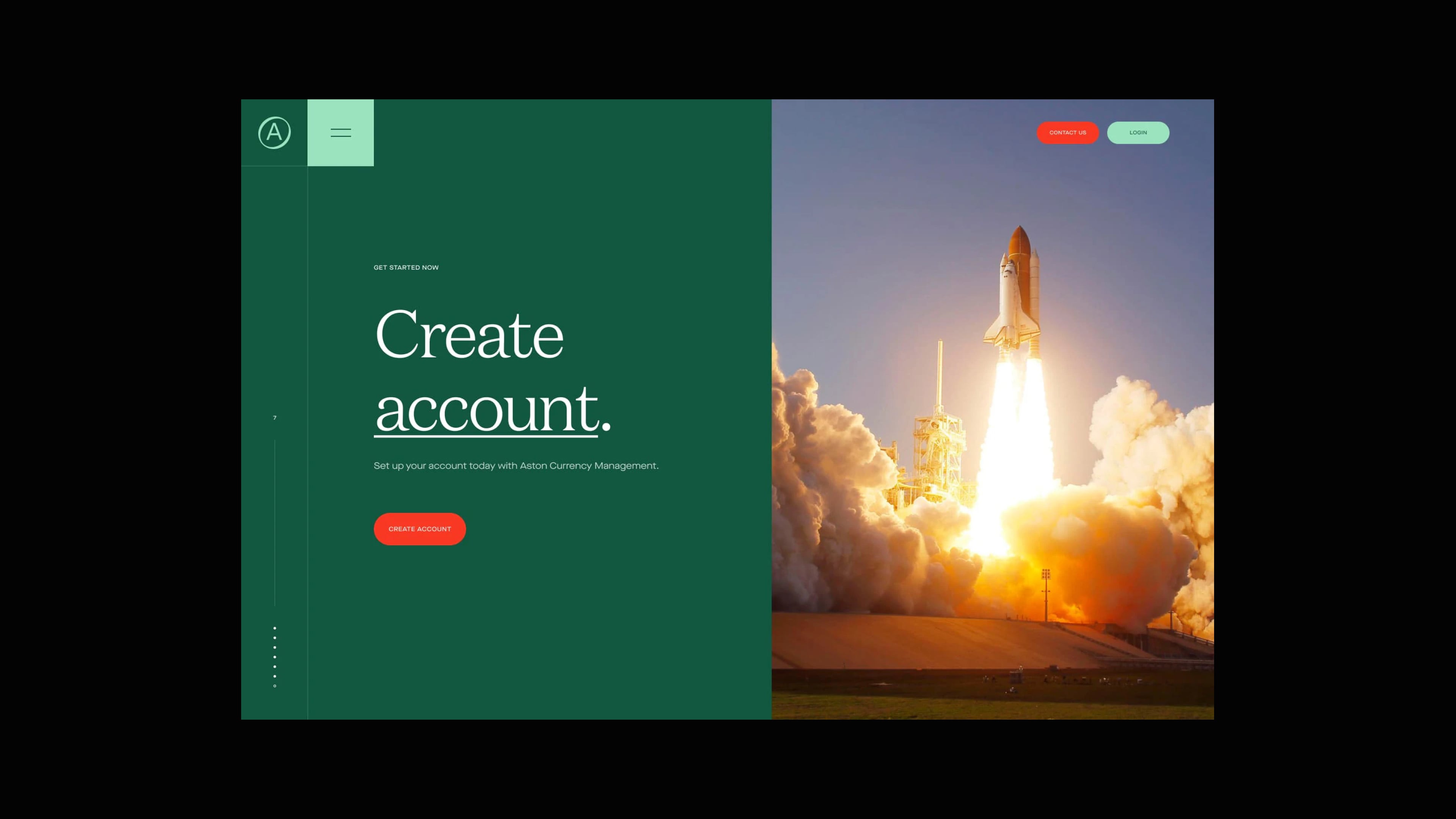
To differentiate themselves from the rest of the market Aston wanted an experience that would stand-out by resonating and delighting their audience. We removed much of the financial jargon and instead led with benefit-driven messages and aspirational imagery. We also implemented a mix of vertical and horizontal scrolling along with micro-interactions across the experience to add elements of intrigue, surprise and delight to help engage with the audience. In order to promote Aston's service-driven approach we also created a Q & A contact form to help guide the audience to the correct type of enquiry and type of account.

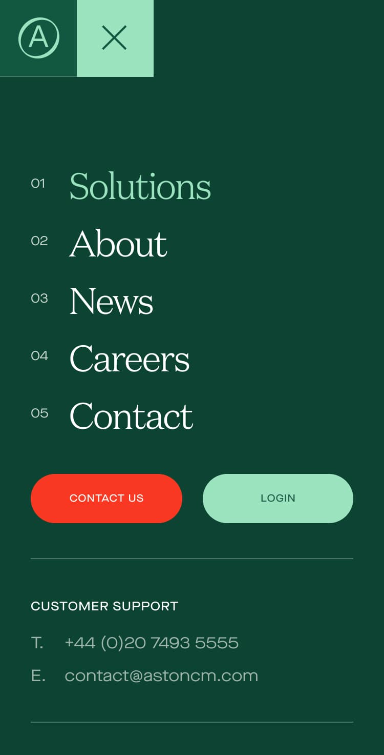
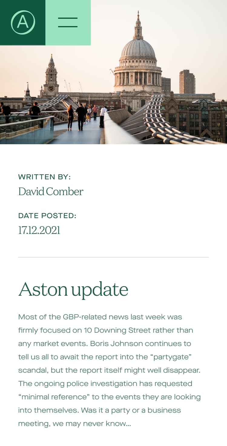
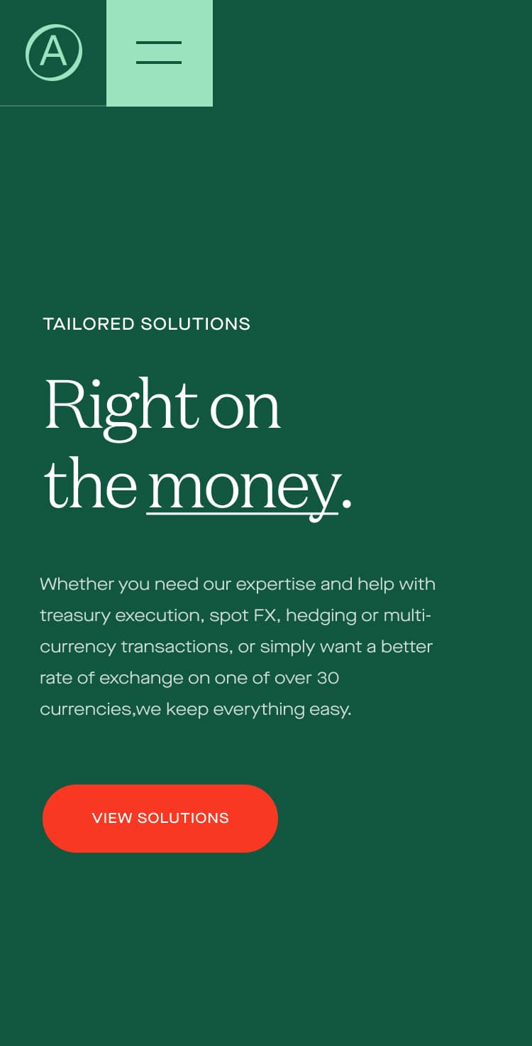
Optimised for mobile
With all our projects we aim to create an equally engaging experience across all screen sizes and wanted the same seamless transitions and functionality across devices without losing much in the way of performance or features.

