SONA
- Strategy
- Digital
- Development
- Motion
- 3D
SONA specialises in luxury smart home automation systems that seamlessly integrate technology into any space enhancing their customers lifestyle.
SONA have become market leaders in smart home automation and are CEDIA accredited for their expertise and offer the highest levels of service to their clients. We worked closely with SONA to design and build an immersive and interactive experience that reflects their brand identity and service while showcasing their exceptional projects. The main objective was to create an experience that ignites the audiences’ imagination as to what is possible in their dream home.
Project Summary
- Brand refresh and udpated messaging aligns better with end product and service
- Modular based framework based on Craft CMS for flexibilty
- Website supports and aligns with marketing and sales team activities
- Immersive experience that aligns with the brands values and their end product
- Demonstrate SONA's commitment to delivering the best-in-class for its customers
Truly express the premium service and innvotive technology
Our primary goal was the need to shift the narrative from focusing on the technology and how these products can be used to enhance your lifestyle. We used the brands philosophy as our north star and focused on expressing the idea ‘bringing luxury spaces to life’. Our vision was to evoke the same level of luxury, elegance and immersion that their customers experience in their home with a SONA system.
I just wanted to say how amazing the site is looking. As it all starts to come together, and the images pull into place I genuinely think we've created something amazing. I'm absolutely over the moon so just wanted to say thanks.Simon Fulstow, Director
Empowering inspirational storytelling
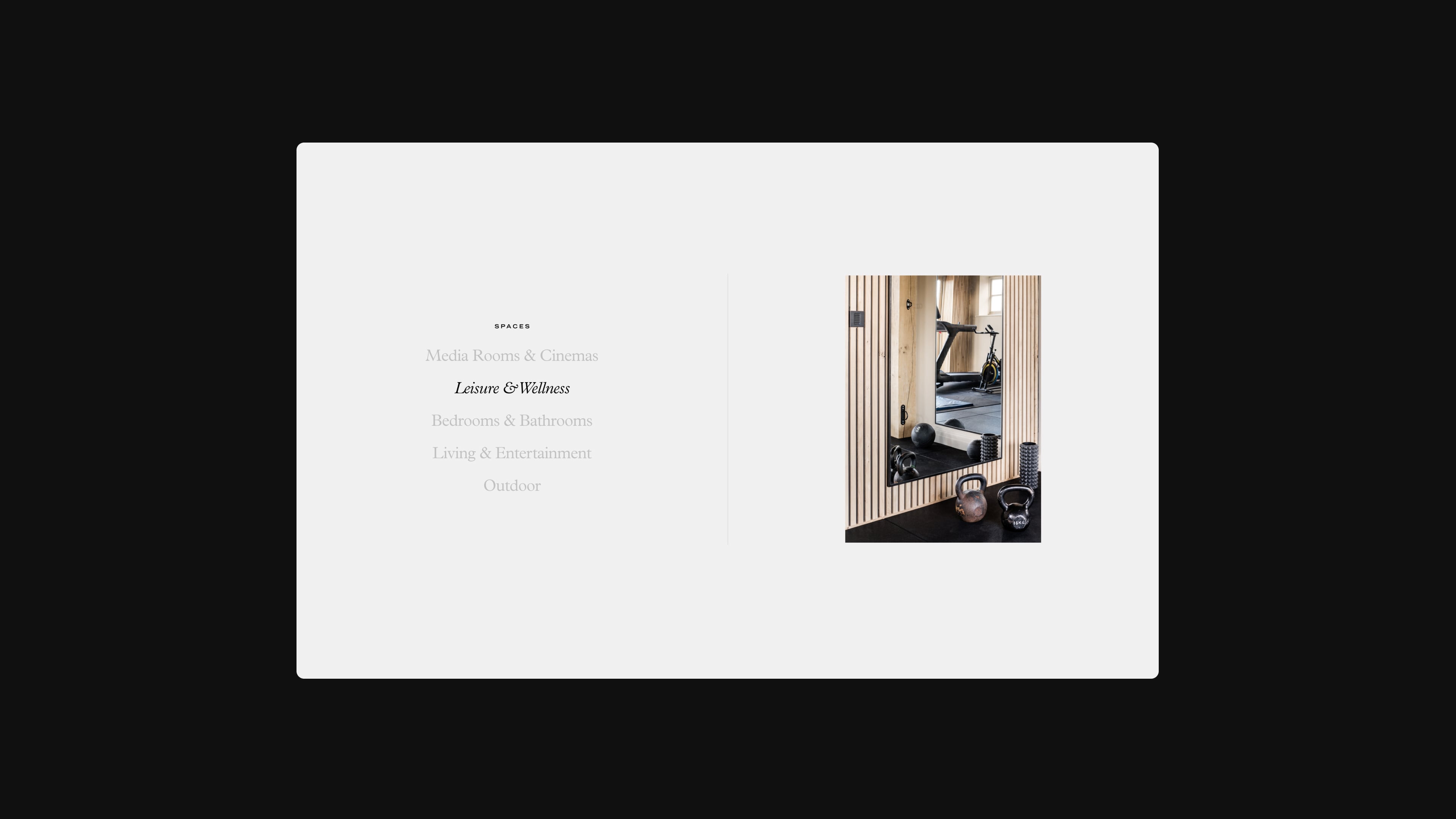
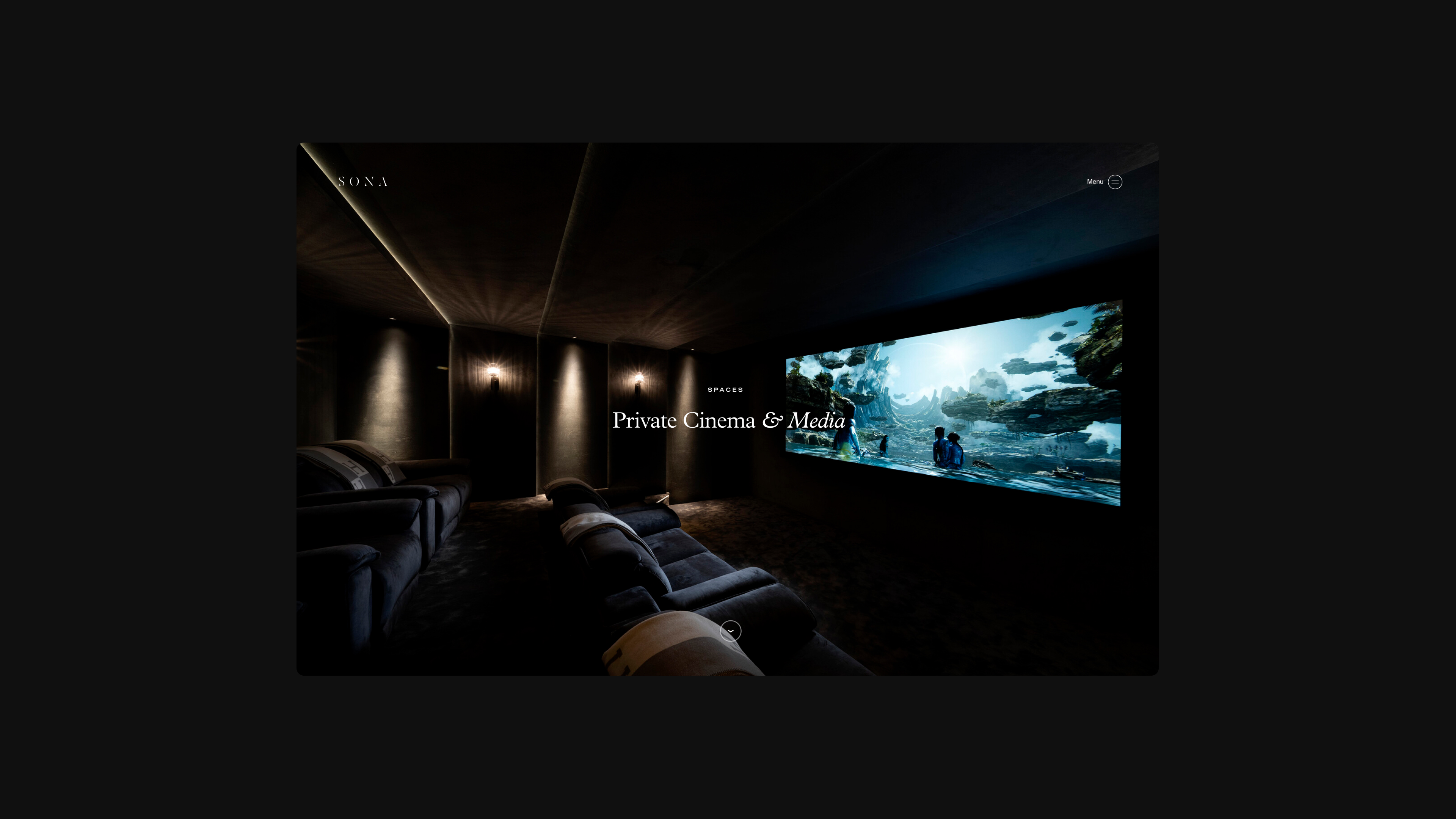
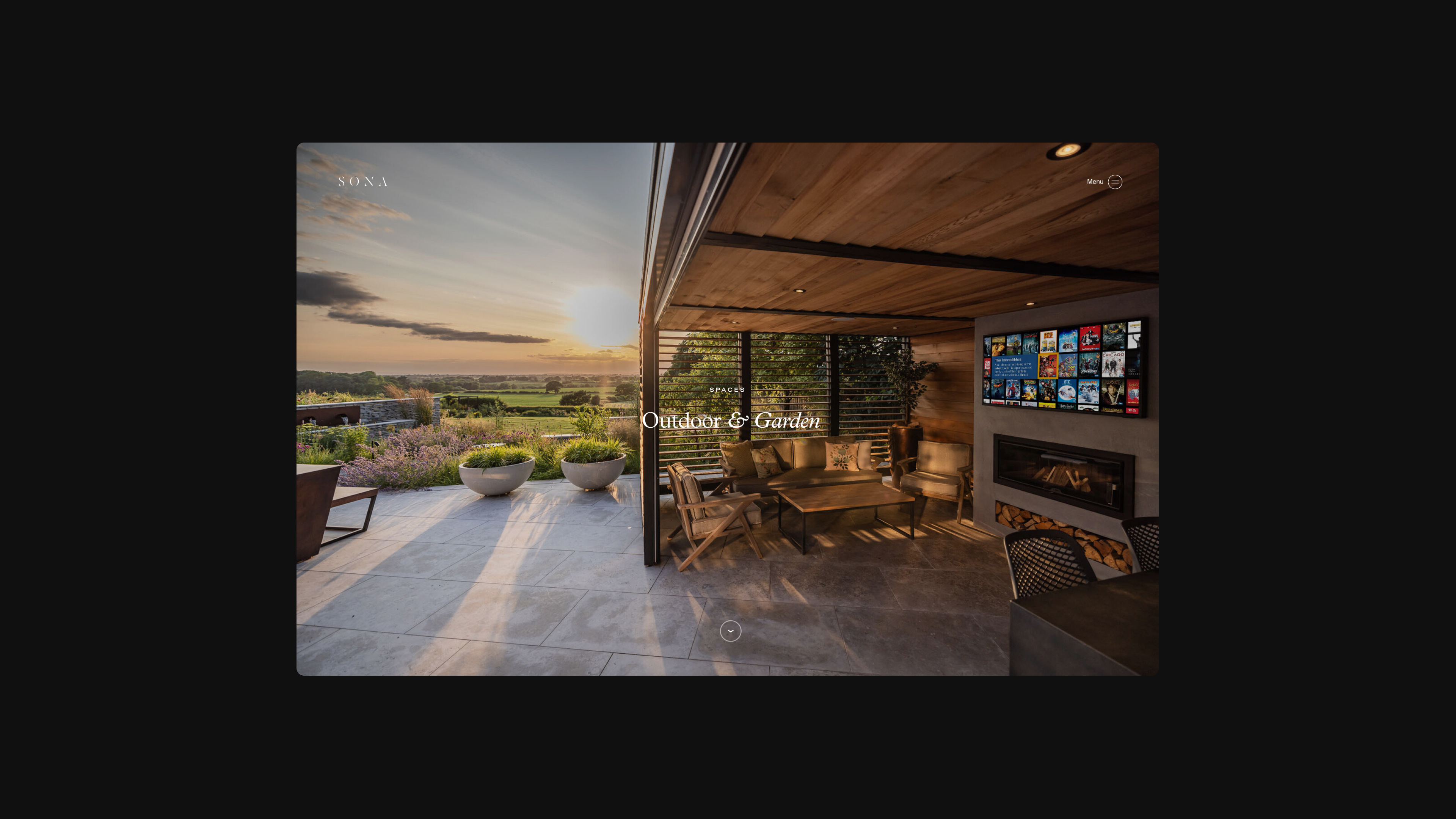
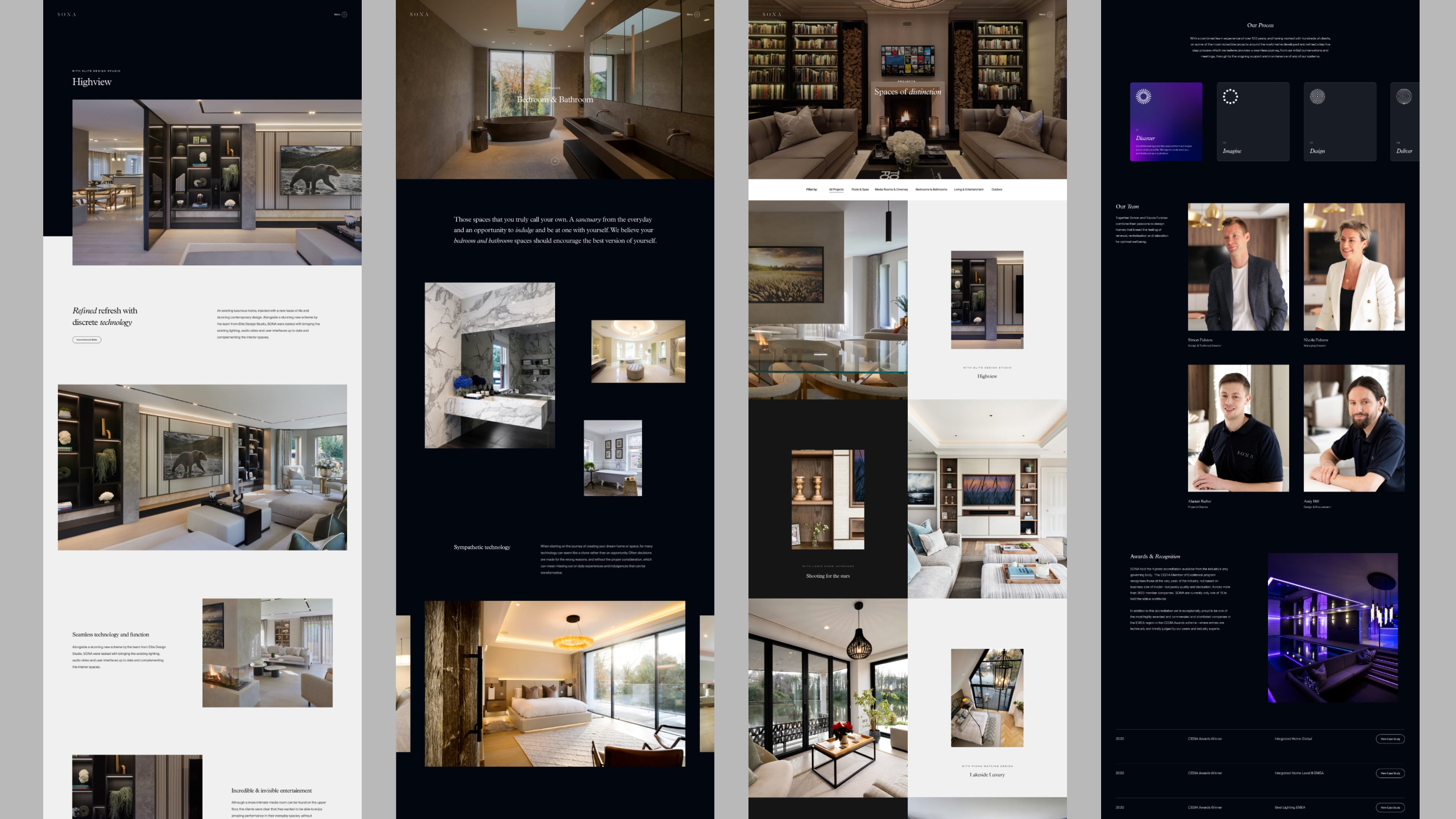
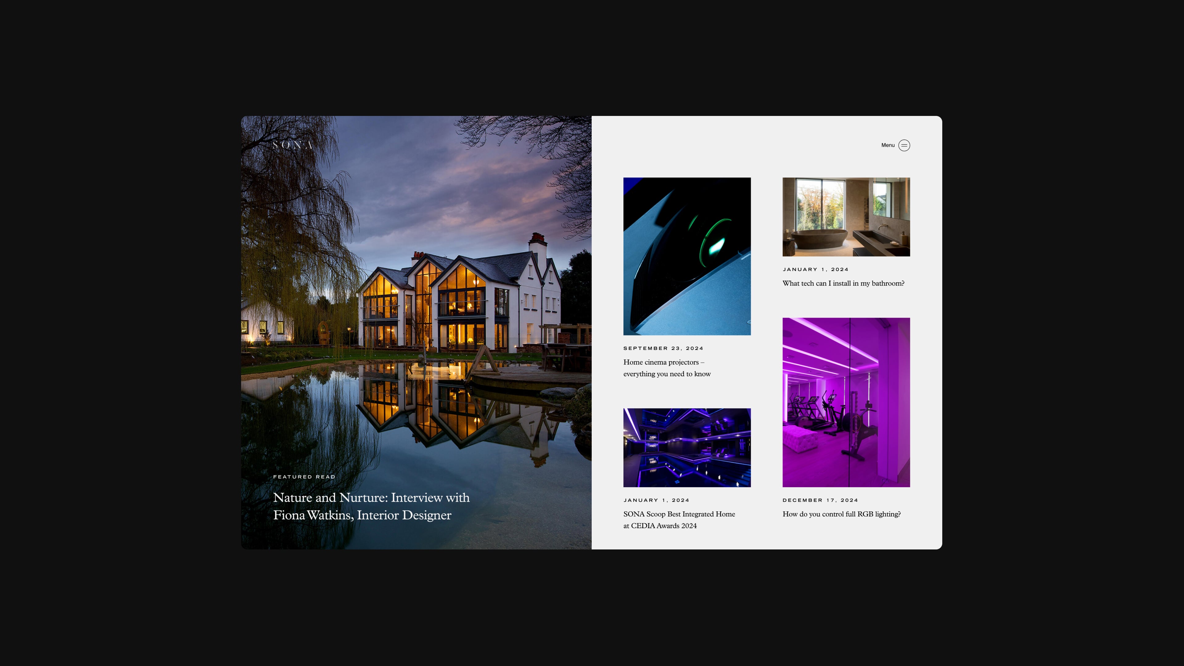
We set out to design a highly modular and customisable design system that would allow the client to truly express their premium service, innovative technology solutions and craftsmanship. By creating a suite of interchangeable and themeable modules we encouraged storytelling throughout the site.

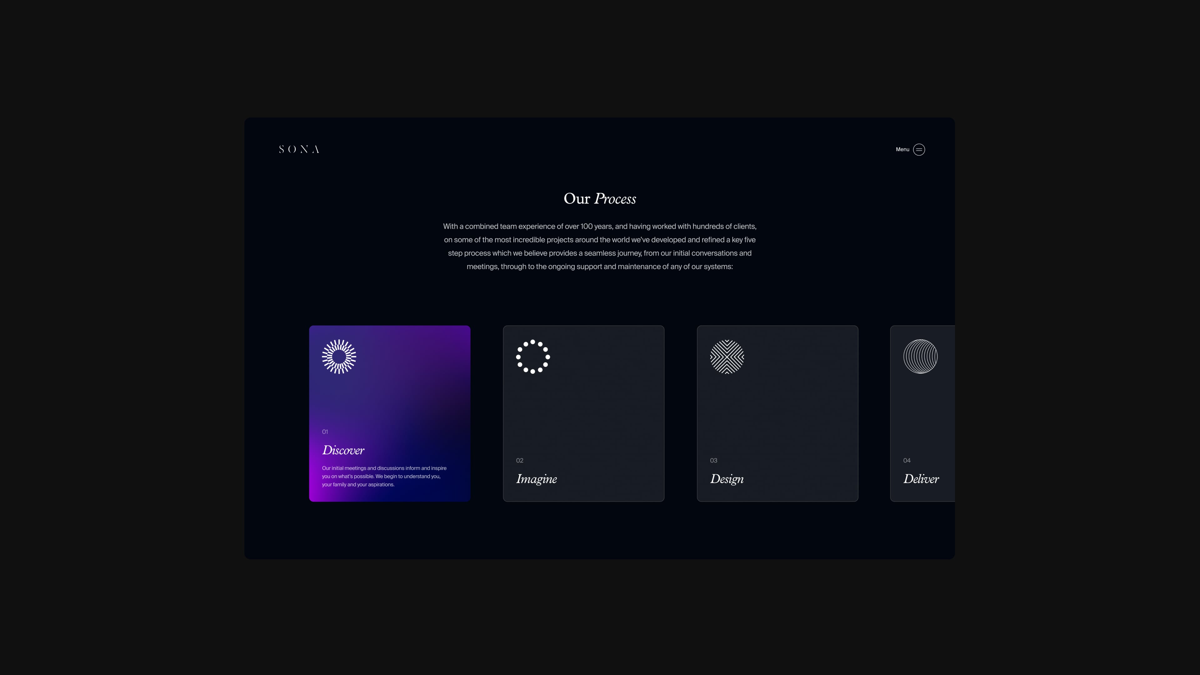
Creating an immersive visual experience
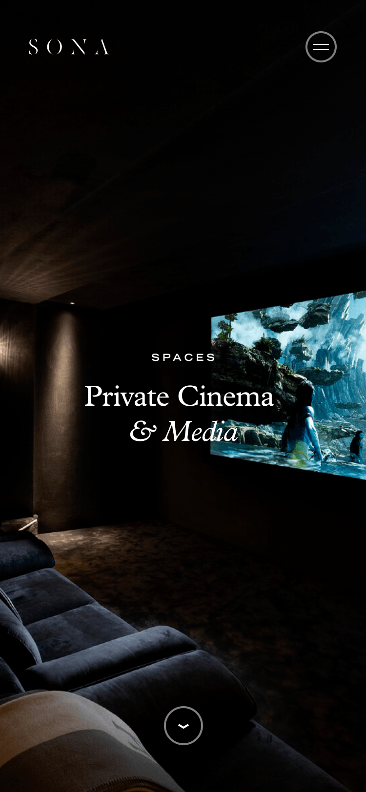
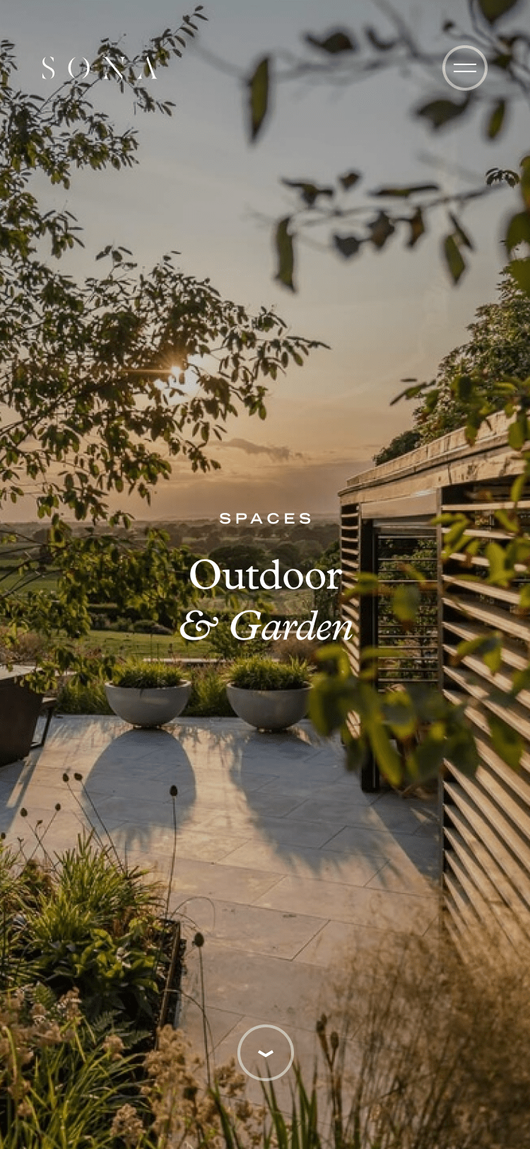
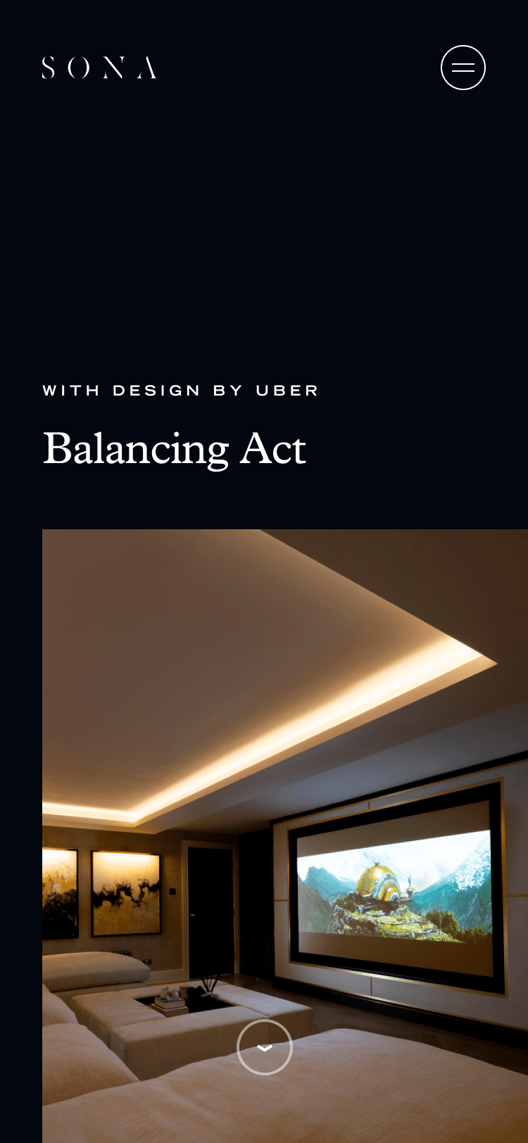
Using the interchangebale modules and theming options allowed us to create specific storytelling moments for the different spaces and services that SONA offers. From the dark and atmospheric environments of home cinemas through to light and elegant bedrooms and bathrooms the customisation features enable pages to be crafted to communicate these sensory focused stories.

Guiding and filtering leads
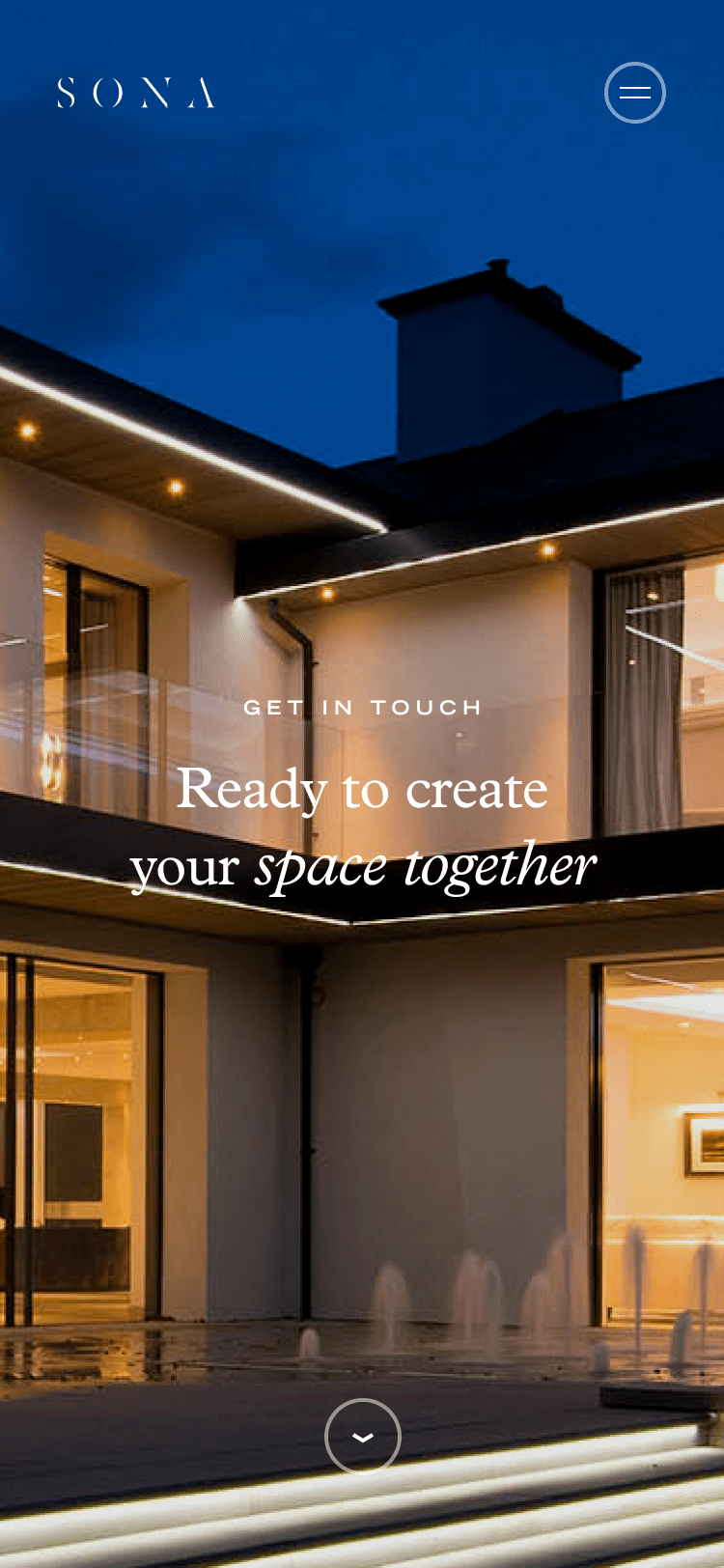
SONA prides itself on it's customer service and this was an important feature on the site. The objective of the contact form was two-fold; to guide the consumer to the correct service and for the client to prioritise and action requests quicker and more efficiently. By setting up a step-by-step Q&A system instead of a standard contact form this allowed SONA to pre-qualify leads effectively, ensuring that only serious inquiries get through while minimizing time wastage and spam.
Bringing spaces to life
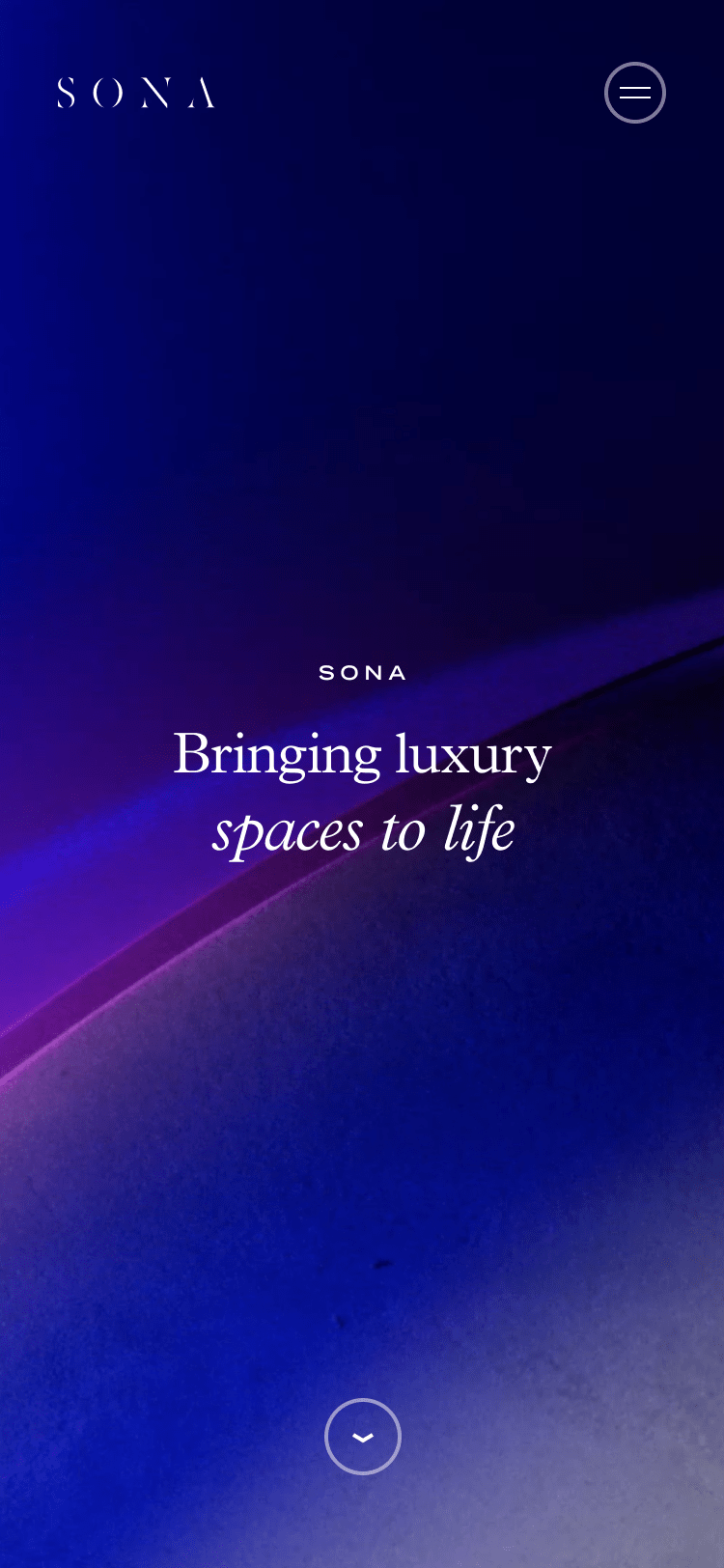
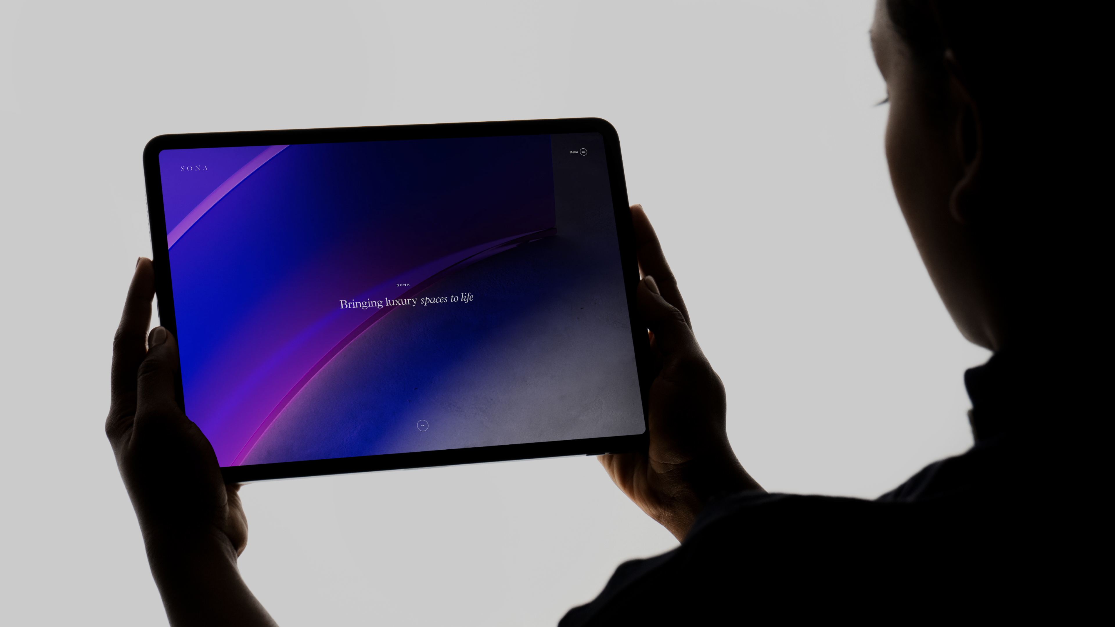
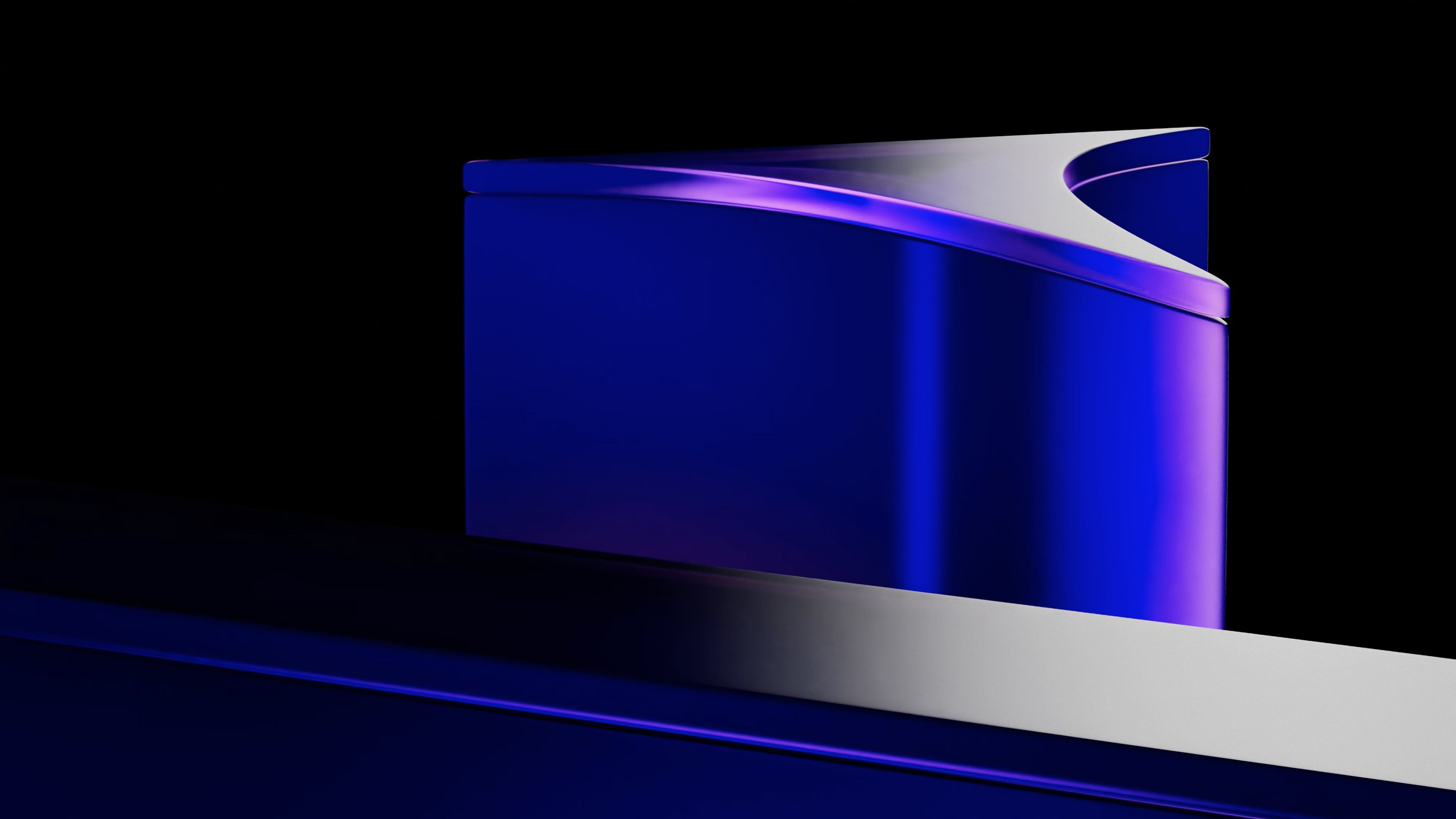
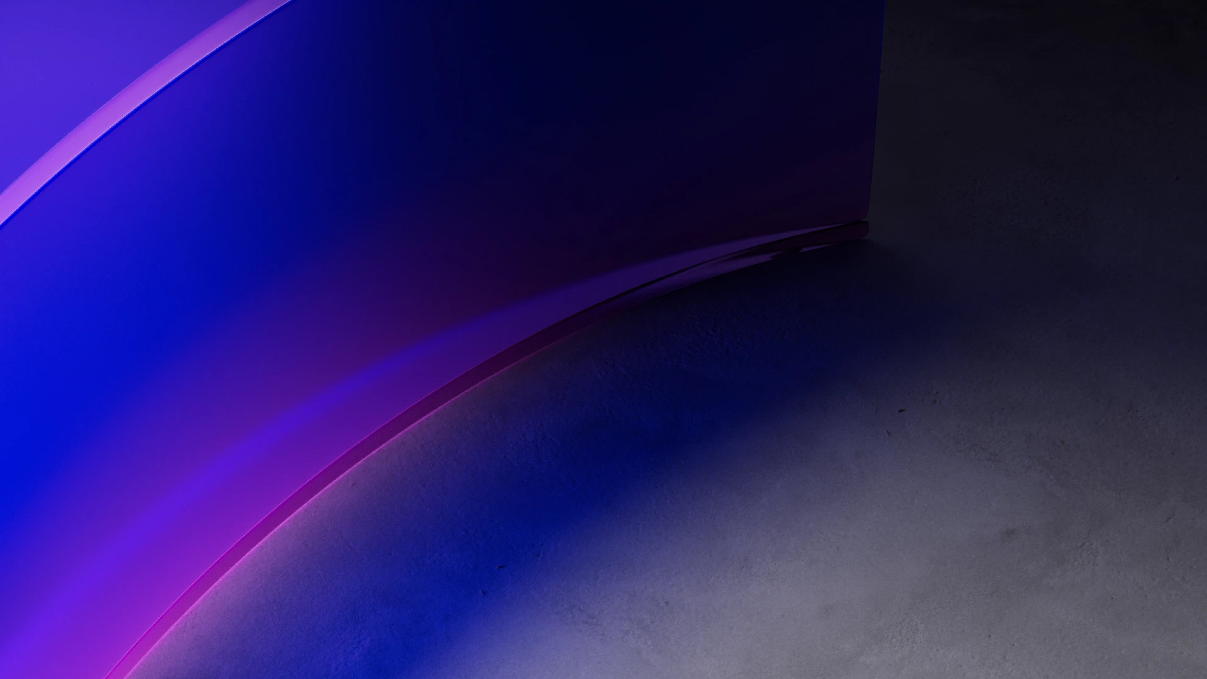
We wanted to express the idea of bringing 'spaces to life' as soon as you land on the homepage of the site. We took the geometric forms of the SONA logo and with a combination of dramatic lighting, subtle textures and close sweeping camera angles created a scene that captures the essence of what SONA does.
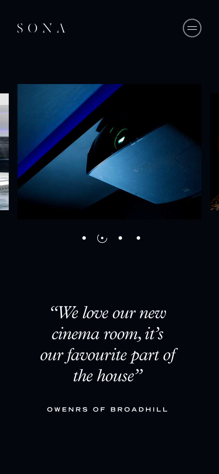
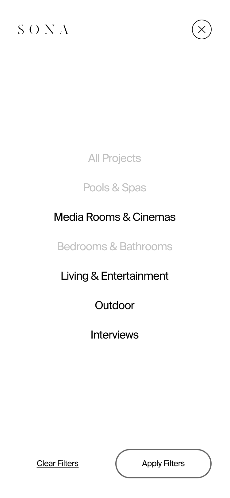
Optimized for mobile
The design language was perfectly optimized for mobile ensuring the brand was still expressed well on smaller screens while ensuring the functionality was maintained.
